Ancient Bamboo in a Modern Twist Fuses Tradition and Sustainability
Meet Qianying Niu of the School of the Art Institute of Chicago. Her recent Gold-winning project, “Bamboo Slips Liquor,” combines ancient Chinese heritage with a sleek, modern edge, reimagining liquor packaging as a rich, cultural experience. Think bamboo slips that unwrap like a scroll, revealing a carved poem inside—part liquor, part Zen philosophy, and all design brilliance. Qianying’s work brings timeless artistry into a sustainable, minimalist package, and it's already setting a new bar in the world of packaging design.
By: Qianying Niu, Visual Artist, Designer, Lecturer, & Former Student, School of the Art Institute of Chicago
The award-winning piece is a design for Bamboo Slips Liquor, drawing inspiration from two key elements. Firstly, it incorporates the ancient use of bamboo slips, historically used in China to record and spread cultural knowledge without paper. Secondly, it reflects the origin of the liquor in Cang-Shan, a town known for its lengthy distillation process, symbolizing the ancient philosophy that patience yields rewards.
The design emphasizes the concept of “Zen,” using black as the primary color to represent purity and depth. The packaging, made from bamboo slips, recreates the experience of opening an ancient scroll. Inside, a Chinese poem, “The Decree of Wine,” is carved on bamboo slips, blending the cultural reading experience with the refined quality of the liquor.
As the first Chinese liquor company to adopt a non-label design, it uses sustainable, reusable materials to address the recycling challenges of the industry. By combining bamboo slips, calligraphy, and a thoughtfully designed bottle, the project seeks to revive traditional reading and drinking cultures. It connects history, ancient Chinese art, sustainable practices, and Zen philosophy to create a rich, meaningful experience for consumers.
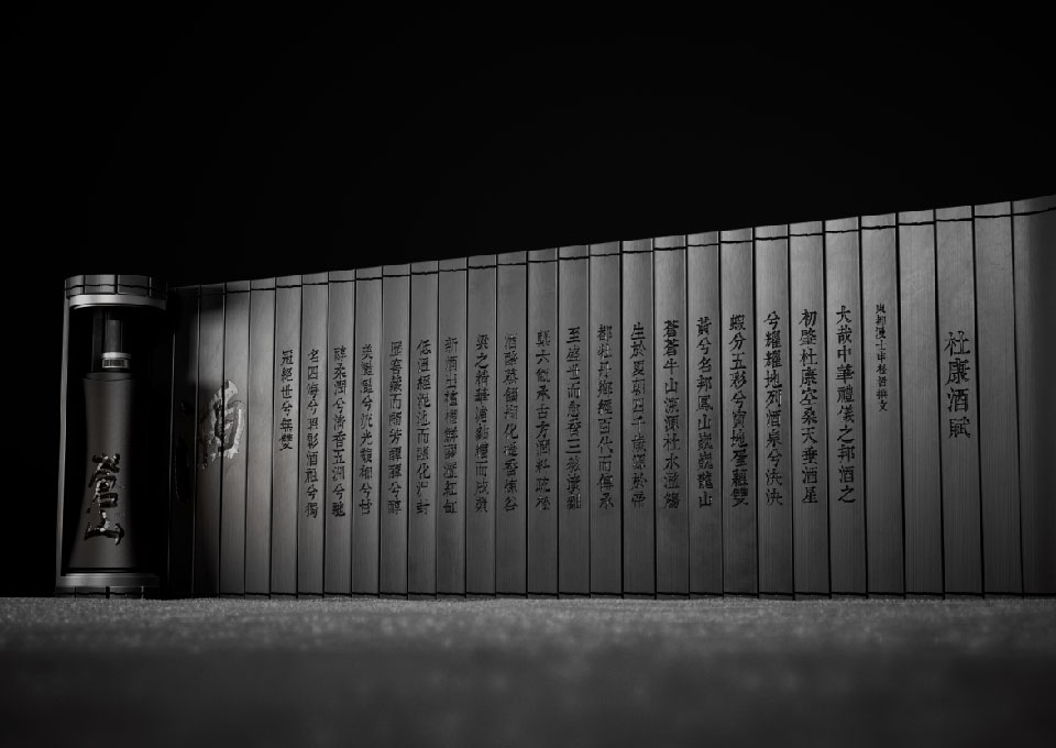
We utilized several innovative techniques and approaches to achieve the final design of Bamboo Slips Liquor. Using bamboo slips required the development of specialized methods to shape, carve, and assemble the bamboo in a way that retained the authentic feel while ensuring durability and functionality for modern use. This process involved working closely with craftsmen and material experts to refine the structure and ensure the material’s longevity.
We also adopted a non-label design for the bottle, which is the first of its kind in the Chinese liquor market. Instead of traditional labels, we integrated the branding directly into the bottle’s design, using engravings and textures that evoke the historical and cultural themes of the product. This minimalist approach required precision and attention to detail to maintain the balance between visual appeal and the simplicity of the Zen concept.
In addition, sustainability was a core focus throughout the design process. We employed eco-friendly and reusable materials, ensuring the packaging could be repurposed or recycled easily, addressing a common challenge in the liquor industry. These innovative techniques allowed us to create a visually captivating and environmentally responsible design, connecting tradition with modern values.
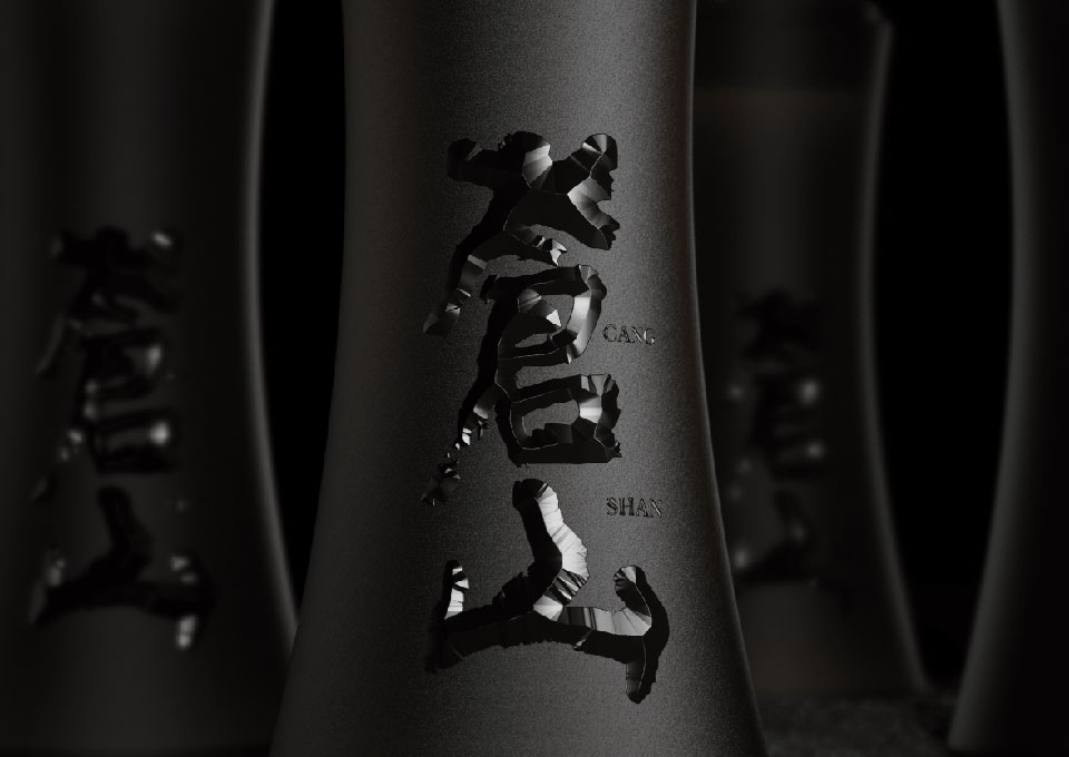
During the creative process of designing Bamboo Slips Liquor, we encountered several significant challenges. One of the main challenges was balancing traditional cultural elements with a modern design aesthetic. To address this, we focused on creating a minimalist yet meaningful look, using black as the primary color to convey a sense of Zen and purity. This allowed us to maintain a traditional feel while offering a sleek, modern appeal.
Another challenge was the technical aspect of using bamboo slips as a packaging material. Bamboo is not a conventional packaging material in the liquor industry, and we had to ensure that it was durable enough to protect the product while being visually appealing. Through extensive prototyping and working closely with material experts, we refined the structure and design, ensuring the packaging was functional and aligned with our cultural vision.
Finally, achieving sustainability without compromising the aesthetic was crucial but challenging. We wanted to create a design that would stand out in the market and be eco-friendly. We overcame this by carefully selecting sustainable and reusable materials, solving the industry’s recycling dilemma, and ensuring that the final product remained true to our vision of blending tradition with environmental consciousness. These efforts allowed us to create a culturally rich and sustainable design.
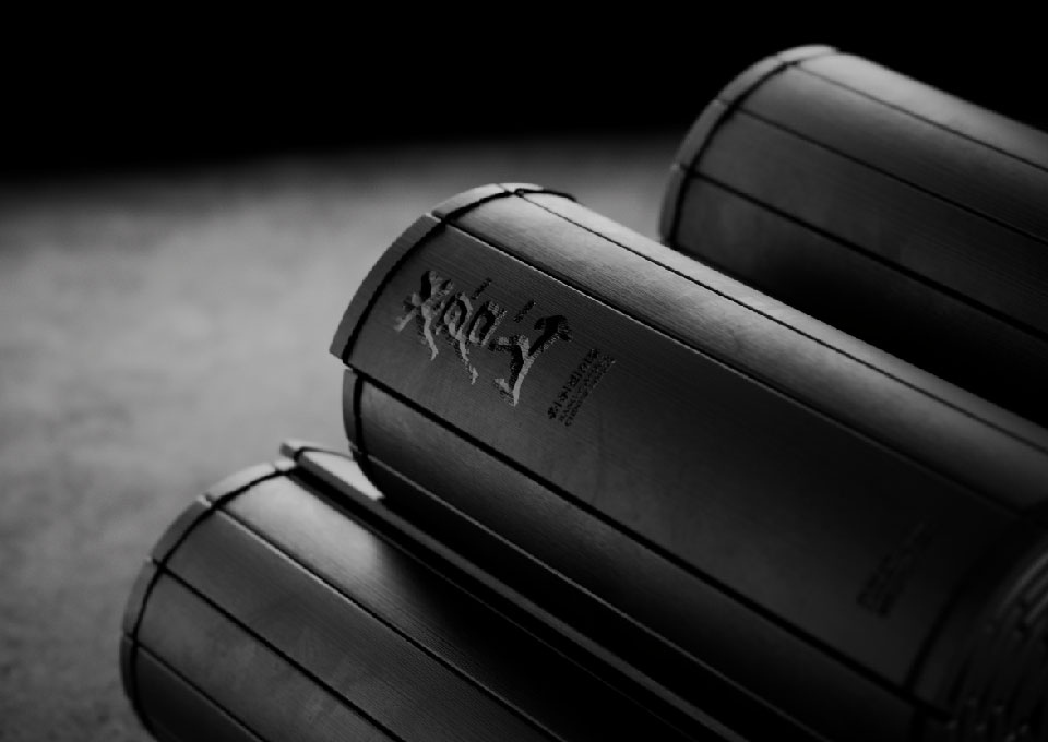
The outcome of the Bamboo Slips Liquor project was a successful integration of cultural heritage, modern design, and sustainability, resulting in a unique product that stands out in the market. The design not only honors the historical significance of bamboo slips as a means of documentation and cultural expression but also reflects the patience and dedication required in the liquor's distillation process from Cang-Shan.
By employing a non-label design and using sustainable materials, we addressed important environmental concerns while creating an aesthetically pleasing and meaningful product. The packaging effectively blends the experience of reading a poem carved on bamboo slips with the enjoyment of high-quality liquor, enriching the consumer’s journey with every sip.
This innovative approach garnered positive feedback from both consumers and industry professionals, helping to revive interest in traditional reading and drinking cultures central to Asian people. Overall, the project has not only created a visually captivating product but also sparked conversations around sustainability and cultural appreciation in the liquor industry, setting a new standard for future designs.
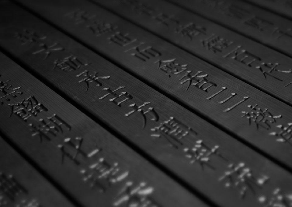
This experience of designing Bamboo Slips Liquor has been profoundly educational and transformative for me. I have learned the importance of deeply understanding and honoring cultural heritage in my design work. By exploring the historical significance of bamboo slips and their role in documenting Chinese culture, I have gained a greater appreciation for how design can bridge the past and present.
Additionally, the project reinforced the value of sustainability in design. I learned that incorporating eco-friendly materials and practices is a responsible choice that resonates strongly with consumers today. This understanding will undoubtedly influence my future projects, as I aim to prioritize sustainability without compromising aesthetic appeal or cultural integrity.
Moreover, the creative process highlighted the significance of storytelling in design. By intertwining the cultural narrative with the product experience, I realized that effective design can evoke emotions and foster connections. This insight will guide me in future endeavors, encouraging me to seek ways to integrate meaningful stories into my work.
Overall, this experience has deepened my commitment to creating culturally rich, sustainable, and narratively compelling designs. I look forward to applying these lessons to future projects and continuing to explore the interplay between tradition and modernity in my work.
Qianying Niu is a visual artist, designer, and lecturer specializing in brand creation, art direction, and packaging design. She graduated from the School of the Art Institute of Chicago and has excelled in packaging experience design within the fast-moving consumer goods (FMCG) industry. Qianying has interned and worked at design firms and renowned top 10 FMCG companies in Connecticut, Chicago, Paris, Shanghai, and Hangzhou, including the French Danone Group, Nongfu Spring Co., Ltd., the Xiongchao Advertising Design Agency, the PJ Loughran Design Studio, and Emily Larned’s American traditional letterpress studio, giving her a broad perspective on the design industry.
The brands she has led and collaborated on include Evian Natural Mineral Water, Volvic Natural Mineral Water, Activia Yogurt, Tea Party, Nongfu Spring Premium Collection Water, and Dongfang Shuying. Her commercial projects include Times Property’s “Dream Symbol,” Midea’s TVC, and Funny Water. Her innovative and thought-provoking artworks have earned her over 40 international design awards from the Italian A Design Awards, the American Communication Arts Awards, the American Graphis Awards, the American Gold Muse Creative Awards, the Korean K-Design Awards, the Dutch Indigo Design Awards, and more.
Moreover, she continually pushes the boundaries of graphic design, exploring new and innovative approaches. Qianying’s works have been exhibited in multiple countries worldwide, including the United States, Canada, South Korea, Taiwan, Italy, China, and the United Kingdom. Notably, in December 2022, her work was prominently displayed in Times Square in New York City.

Discover other New Talent 2024 winners here.
You may also like
Reimagining Discovery: The Creative Journey Behind the Cornell Lab of Ornithology Visitor Center Redesign
C&G Partners brings clarity, warmth, and imagination to the redesign of the Cornell Lab of Ornithology Visitor…
Read MoreA Collaboration of Mind, Music and Meaning, by Michael Pantuso and Ron Taft
When Michael Pantuso got a surprise call from Ron Taft, it sparked a creative partnership that gave…
Read More
Related Annuals & Publications
View AllBecome a Graphis Member
- 1-Year Membership Subscription
- Enjoy 50% off on Call for Entries
- Your Portfolio online with profile + links
- Get 20% off on Graphis Books

