A Collaboration of Mind, Music and Meaning, by Michael Pantuso and Ron Taft
When Michael Pantuso got a surprise call from Ron Taft, it sparked a creative partnership that gave music a new visual heartbeat and also won them another Graphis Platinum Trophy. Together, they built SOAR, a striking icon that turns instruments into wings and celebrates the power of music to lift minds, inspire learning, and move hearts—all with the precision, imagination, and care that Graphis champions.
By Michael Pantuso
When Ron Taft called me one afternoon, completely out of the blue, it set in motion a collaboration I could not have anticipated. I knew Ron’s work, of course. If you are active in the world of design long enough, especially within the ecosystem that Graphis cultivates, certain names find their way into your orbit. Ron’s was one of them. His work had an unmistakable presence in the annuals. It was thoughtful, refined, and rooted in a level of craft that always stood out. Our work had appeared in many of the same books through the years, often on facing pages, yet we had never met or exchanged a single word. His call began as a simple gesture of introduction. Within minutes it evolved into something more: an invitation to help bring a new artistic symbol into the world.
There was no preamble, no slow buildup. He said he had a collaboration in mind and that he believed the idea would benefit from the way I work and the way I think about art. He described SOAR for the first time, not as a brand or marketing effort, but as a cause that needed a visual heartbeat.
It was not a paid assignment. It was not positioned as a commercial project. Instead, it was a deeply meaningful initiative born from Ron’s belief, and mine, that music has an undeniable ability to shape young minds and expand human potential. Everything he shared pointed in the same direction. What he needed was not a contractor. He needed a partner who cared about the message as much as the craft. I knew immediately that I wanted to be part of it.
The Mission: A Symbol for Music’s Transformative Power
SOAR: On the Wings of Music is built on a simple truth that has been proven again and again. Musical training strengthens cognition and expands opportunity. The science is not speculative. It is irrefutable. Even modest exposure to music in childhood strengthens neural pathways, improves comprehension, enhances reading and math skills, supports emotional regulation, increases social confidence, and helps develop the kind of problem solving that influences a lifetime of learning.
Despite this, funding for music education in the United States has been stripped away in countless communities. Programs have been reduced to the margins or eliminated entirely. Entire generations are being denied access to one of the most reliable, accessible, and proven tools for cognitive development. The contradiction is almost unbelievable. And the consequences reach far beyond the arts. When you remove music, you remove a pathway to learning itself.
SOAR exists to help close that gap. The initiative raises awareness and directs funding to music education programs, including The Mr. Holland’s Opus Foundation. Through strategic partnerships and creative collaborations, SOAR aims to champion the idea that a musically developed brain is a more capable, compassionate, adaptive brain. That message required a symbol. It needed to be expressive, engineered, emotional, and intellectually grounded. It needed to embody the idea that music shapes both mind and motion.
That is where Ron and I began.
A Leap of Faith and an Immediate Creative Sync
Collaborations can be unpredictable. You never know how two creative sensibilities will merge until you are in the thick of the work. But from the beginning, Ron and I found a rhythm that reminded me of working with musicians. There was no rigid path to follow. Instead, we explored ideas in a way that felt improvisational and fluid.
If you have ever spent time in a recording studio or rehearsal space, you know the rhythm of that environment. Someone introduces an idea. Someone else responds. A phrase becomes a motif. A motif becomes a movement. Creative momentum takes over and the work begins to grow naturally. Ron brought that same energy to SOAR. He came with a concept that was both clear and open. The boundaries were defined enough to provide focus, yet flexible enough to allow the artwork to reveal itself.
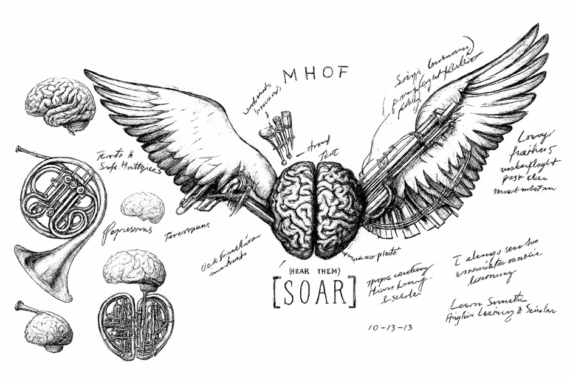
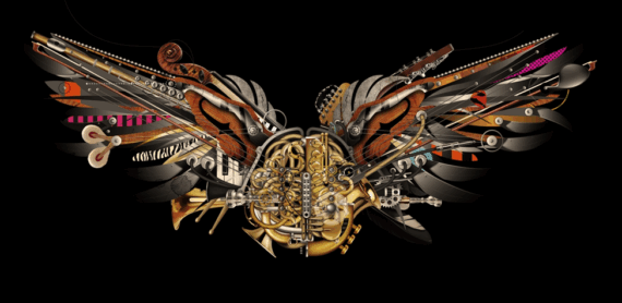
He showed me a rough napkin sketch, nothing more. It was a simplified gesture of a brain, made entirely of instruments, with wings extending outward as a visual expression of learning and uplift. I did not need a formal brief. The sketch itself was enough to spark the direction. It was the seed of something that could become powerful if built with care and intention.
Ron is not only a designer. He is a musician. That combination is rare, and it shaped the collaboration in important ways. He understands instruments not only as objects but as systems of engineering and emotion. He knows what parts musicians touch and rely on. He knows the quirks of mechanisms that most people never notice. His insight became a critical part of the early stages, helping refine the gestures and details that would eventually give the SOAR icon its authenticity.
Research: Into the Mechanics and Soul of Musical Instruments
I have always believed that truth in conceptual art requires real research. It requires immersion. Even if the final piece becomes symbolic, the foundation must be grounded in reality. For SOAR, that meant diving into the mechanics, forms, and histories of musical instruments.
I studied brass, strings, woodwinds, and percussion from every possible angle. I looked at the architecture of horns, the geometry of violin bodies, the tension systems within pianos, the visual logic of woodwind keys, and the complex ways that instrument parts interconnect. Some of this research took place online. Much of it required hands-on study. I visited music stores to feel the weight of the instruments and to understand the subtle differences between lacquered brass and brushed nickel, between the polished surface of a clarinet key and the textured grain of a violin bridge.
Musicians have affection for details that the average person never sees. They notice the way light bends across a string under tension. They feel the resistance in a valve and understand the mechanics behind that resistance. These small details carry emotional significance. Ron understood all of this intuitively, and his knowledge helped guide the fidelity of the artwork. The ambition was not to simply depict instruments. It was to build a bridge between the design language of musical engineering and the conceptual architecture of human cognition.
The illustration could not feel like collage. It needed to feel alive, cohesive, intentional, and engineered. That required a biomechanical approach rooted in precision.
The Construction of the Icon: A Digital Hand-Drawn Anatomy of Sound and Thought
As the research deepened, I began constructing the artwork itself. As I typically do, I built the entire illustration digitally, developing it layer by layer in Adobe Illustrator before refining the lighting, tonal transitions, and final curve adjustments in Photoshop. Every reflection, shadow, contour, and mechanical element was drawn by hand within the digital space.
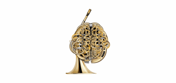
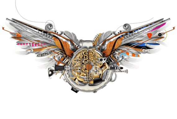
The Brain (Cognition)
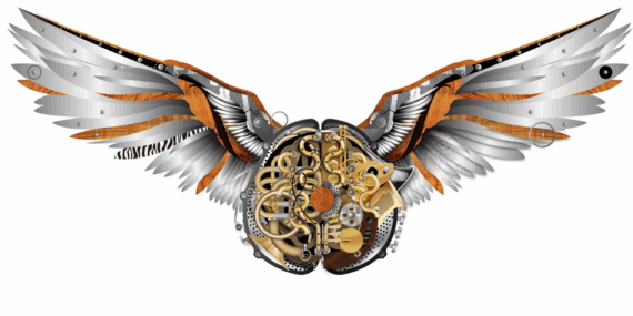
The brain sits at the center of the composition. It is not symbolic. It is structural. It is the literal engine of SOAR. The form is made of interwoven brass tubing, woodwind key assemblies, and mechanical linkages that mimic the folds and sections of a human brain. The goal was to create a biomechanical anatomy that could exist only at the intersection of sound and thought. The more the structure developed, the more it became clear that this was not simply a visual metaphor. This was a representation of cognition shaped by music.
The Wings
The wings extend outward in a broad, open gesture. They are built from musical components arranged to feel both architectural and organic. Piano keys, guitar frets, tuning mechanisms, violin bows, and percussion details became the feather structures. Each feather plays a dual role. It anchors the wing mechanically and carries symbolic meaning. Together, the wings create a sense of elevation and forward motion, suggesting both intellectual and emotional uplift.
Biomechanics as a Visual Language
The aesthetic draws from the conceptual spirit of biomechanical art, though without its darker tones. Instead of leaning into the surreal or dystopian, the piece uses biomechanical principles to express vitality, connectivity, and possibility. The artwork needed to feel engineered, but also human. It needed to convey motion even in stillness.
A Six-Month Dialogue Through Art
The illustration evolved slowly through a six-month period of intermittent work. Some weeks were intense. Others were contemplative, allowing the piece to rest while new ideas settled into place. My process usually follows the same pattern. I build until the composition becomes dense. Then I remove, refine, simplify, and sharpen. Eventually the piece reaches a stage where I recognize that the work no longer benefits from addition. That is when I know it is done.
There were no shortcuts. No templates. No AI tools. Not because I am opposed to them. This artwork simply required the kind of digital hand drawing that grows from patience, observation, and immersion. It needed the gradual layering and methodical touch of a human hand.
When the illustration was complete, I passed it back to Ron. He integrated it into the brand system he had developed for SOAR, applying typography, color, context, and messaging. The final icon became a fusion of two creative approaches. My illustration gave SOAR its voice. Ron’s branding gave it its language.
What began as a chance phone call became a partnership that felt both effortless and meaningful.
A Collaboration Born from Graphis and Returned to Graphis
Looking back, I realize that this collaboration was shaped long before Ron ever called. Graphis played a role in that. Through the years, Graphis Annuals introduced us to each other’s work long before we became collaborators. When you see another designer’s work published repeatedly, you begin to understand the way they think. You recognize the consistency of their approach, the rigor of their craft, and the values embedded in their decisions. It creates a kind of silent respect.
SOAR is an example of what can happen when that silent respect becomes an active collaboration. It reflects the best of what the Graphis community nurtures: high standards, curiosity, shared enthusiasm, and the understanding that design can serve something larger than itself.
Why SOAR Matters
SOAR is more than an artwork. It is more than a brand icon. It is a call to action. It affirms the belief that music education is not optional. It is essential. It strengthens individuals. It strengthens communities. And it expands futures.
The SOAR icon is a reminder that the arts do not merely entertain. They build cognition. They build character. They build confidence. They help shape minds that are capable of empathy, adaptability, and creative problem solving.
I am grateful that Ron reached out. I am grateful for the trust he placed in me and for the opportunity to build something meaningful with a collaborator who shares the same reverence for craft. And I am grateful to Graphis for continuing to be a space that connects artists, inspires unexpected partnerships, and champions the kind of work that carries purpose.
SOAR does not simply represent music. It embodies the idea that music can uplift, clarify, strengthen, and guide us. When we invest in musical learning, we invest in the cognitive and emotional foundation of future generations.
On the wings of music, we do not simply learn.
We ascend.
What’s Next for SOAR
SOAR continues to evolve far beyond the creation of the icon itself. The next phase is focused on expanding its reach and deepening its impact through both artistic expression and strategic partnerships. Limited edition fine art (archival) paper and metal prints of the SOAR illustration will be made available to funding contributors, offering supporters a chance to own a piece of the artwork that helped define the mission. These prints are intended not only as collectible works of art but as symbols of advocacy. Each one serves as a reminder that creativity can play an active role in shaping opportunity for young people.
In addition, SOAR is developing a clothing line that extends the message into the world in a more visible, everyday form. Early discussions are underway with a notable clothing designer to help guide this effort and to position the line within a larger cultural conversation. The vision is for SOAR to become part of a recognizable movement carried by artists, musicians, performers, and supporters across the entertainment industry. Proceeds from the clothing line will go directly toward music education and the broader SOAR mission, reinforcing the idea that design, fashion, and purpose can work together to create meaningful change.
What began as a single collaboration now has the potential to grow into a platform that engages communities, inspires new generations, and supports the belief that every child deserves access to the transformative power of music.
Initial Sketch from Ron Taft:
Digital Step 1:
Digital Step 2:
Digital Step 8A:
Digital Step 9:
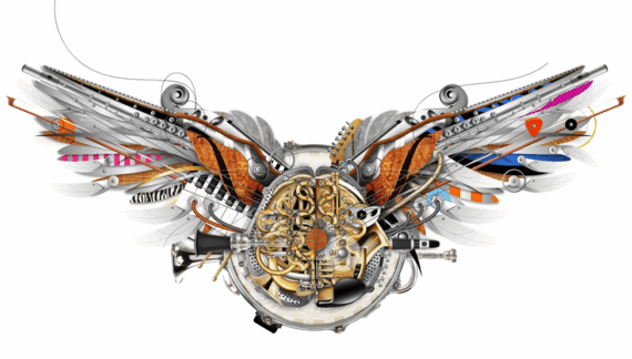
Digital Step 10:
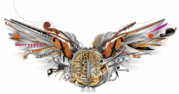
Digital Step 20 (White Background):
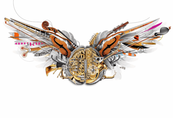
Digital Step 21 (Black Background):
Final:
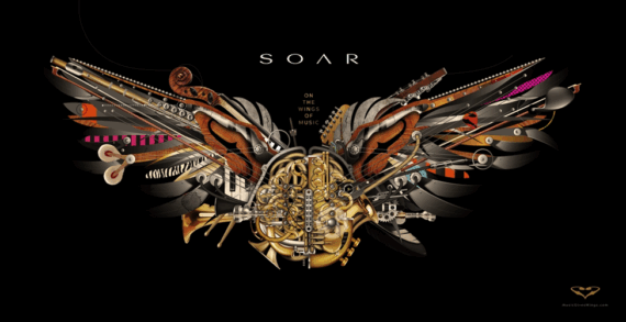
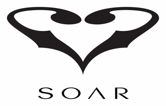
SOAR ICON:

SOAR Lockup:
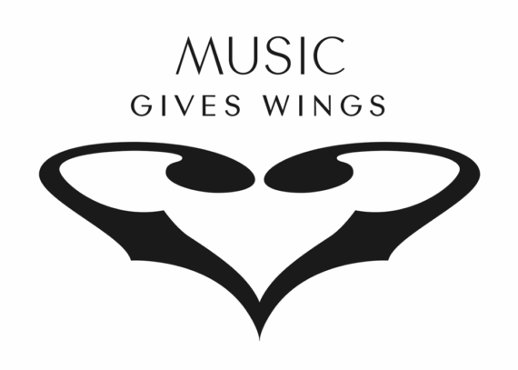
Music Gives Wings Lockup:
Apparel Pin:

About Michael Pantuso
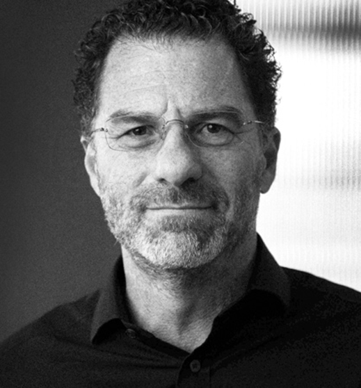
Michael Pantuso is a Graphic Designer, Illustrator, and Artist based just outside Chicago, and the founder of STUDIA, a multidisciplinary brand design collective with partners in Chicago, San Diego, and Los Angeles. STUDIA blends strategic thinking, visual design, digital innovation, and storytelling to help organizations build authentic, memorable brands. The studio operates with the agility of a boutique and the depth of a full-service agency, guided by the belief that strong design begins with clear ideas and is elevated by thoughtful execution.
Pantuso’s brand work is grounded in strategy, driven by the idea that design amplifies meaning rather than decorating it. His fine art, by contrast, is exploratory and intuitive. Working in both traditional and digital media, he builds visual anatomies that merge natural forms with mechanical logic, revealing the structural intelligence embedded in living systems. His work examines dualities, inviting viewers to see the connection between the organic and the engineered.
About Ron Taft
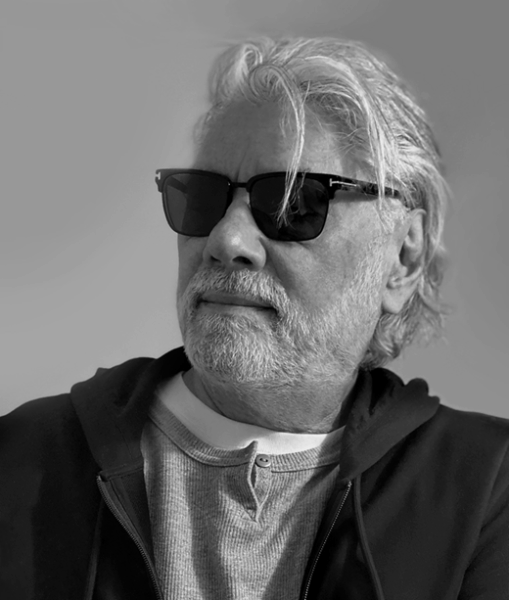
Executive Creative Director | Designer | Musician
Ron Taft is a multi-disciplinary brand innovation & media arts strategist, creative director and designer. Recipient of 32 Graphis awards and numerous international design and industry awards, including 2 Emmys for Columbia TriStar Television and 2 artist award-winning Grammy campaigns.Ron brings a string of celebrated brand innovation and media arts to market and has created many brand identities, product launches, branded events, and advertising and promotional campaigns for such clients as Sony Pictures, HBO, The Emmys, Leo Schachter Diamonds, Hästens, United Recording, Guitar Center, Roland, Berklee College of Music, Microsoft, Nike, Ferrari, Stella Artois, and NASA.
Ron has served on the boards of The Quincy Jones Music Consortium and The Mr. Holland’s Opus Foundation, and has created outreach campaigns and promotional initiatives for NAMM, Music Rising, The NARAS Foundation, The Academy of Television Arts and Sciences, Kidspace Children’s Museum, ArtCenter College of Design, and Berklee College of Music.
Having been a professional musician in his early career years, Ron embraces an unwearying passion for all things music.
Be loud. Be clear. Be UNMUTED! Enter Graphis UnMuted Awards here!
You may also like
Reimagining Discovery: The Creative Journey Behind the Cornell Lab of Ornithology Visitor Center Redesign
C&G Partners brings clarity, warmth, and imagination to the redesign of the Cornell Lab of Ornithology Visitor…
Read MoreVisualizing Climate Impact in Unexpected Hues
Gold in the Poster Awards 2026, Franziska Stetter’s Unexpected Hues – Human Impact on Ocean Colors turns…
Read More
Related Annuals & Publications
View All


Become a Graphis Member
- 1-Year Membership Subscription
- Enjoy 50% off on Call for Entries
- Your Portfolio online with profile + links
- Get 20% off on Graphis Books