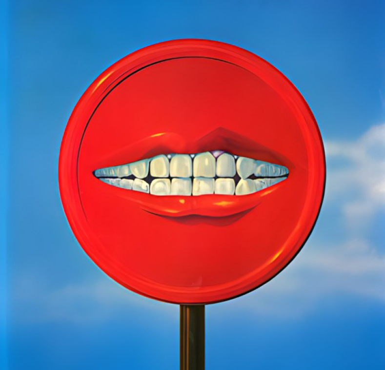
Nicholas Duers Captures Jewelry on Ice
For the November issue of Flaunt magazine, photographer Nicholas Duers shot a six-page jewelry editorial inspired by Greenland’s shifting ice and mist. The project, part of the issue’s theme of “Where Are We Going?” explores the fleeting balance between permanence and impermanence—pairing iconic Bulgari designs with environments that existed only for a moment in time. Translating the Arctic’s spirit of change into a controlled studio setting, Nicholas embraced imperfection, adaptation, and chance to create images that honor beauty in its most transient form.
By: Nicholas Duers, Photographer, Nicholas Duers Photography
In October 2024, Flaunt magazine reached out with an invitation to collaborate on a photoshoot for its November issue. The issue’s theme, Where Are We Going?, was described as:
“Where Are We Going? will embrace the notion of symbolic transience into the fall and winter months, while embracing travel and futuristic ideas. Throughout Where Are We Going? will be spotlights of the next generation’s creative youth—those who may very well be leading us to wherever the issue is going.”
For this editorial, I was given the opportunity to propose a concept. Just a few months earlier, I had been traveling through Greenland for a personal photo project—sailing through Scoresbysund, a remote and largely uninhabited fjord system on the east coast, and visiting Ilulissat, the country’s third-largest city and one of its most active glacial regions. Witnessing these places—where the landscape is rapidly transforming—left me reflecting on themes of transience and change. My intent was to weave the visuals of that place into the editorial: a photographic story centered on the delicate balance of impermanence and fleeting beauty.


While the resulting story draws inspiration from the landscapes of Greenland, the focus remains on a universal, artistic idea. It is not intended as commentary on the geopolitical or environmental realities of the Arctic but rather as a reflection on how themes of transience and adaptation can inform the creative process itself.
To propose my idea to the magazine, I built a pitch deck inspired by the images I had captured of Greenland’s shifting landscapes. It included mood references, lighting direction, and rough compositional sketches. Flaunt approved the vision, and I began shaping a six-page story (four single pages and one double-page spread).
The process started with detailed sketches of each shot, which allowed me to map out the materials I would need. My aim was to interpret the look and mood of the Arctic into my own vision, expressed through studio photography—using controlled sets and lighting. That meant ice, snow, water, and fog—and a color palette spanning shades of white, black, gray, and blue. While artificial snow, freeze spray, and water were straightforward, sourcing ice required more research. Luckily, New York has no shortage of purveyors supplying perfectly clear (or striated) ice, custom-cut into blocks for the city’s bars and restaurants. For fog and mist, I turned to a handheld smoke machine, which allowed for precise placement of atmospheric effects.


Once the ice arrived, I dedicated a day to pre-lighting, testing how it interacted with various lighting techniques, and experimenting with its relationship to snow, mist, flame/heat, and freezing spray. By the end of that day, I had managed to create a couple of test images that looked promising, and I was ready to begin building the final shots.
On shoot day, the first major challenge was one I had anticipated: the ice melted quickly. Therefore, any jewelry touching the ice would inevitably shift. Most setups involved groups of products, and balancing each piece on the ice was possible but precarious, requiring careful precision. At times, I would even melt the ice slightly to create small indentations where the jewelry could rest more securely. Since the ice was constantly changing, I had to ensure the pieces stayed steady long enough to capture multiple exposures. Normally, I would rely on focus stacking to achieve complete sharpness across a scene like this, but with the constant shifting, stacking was not viable. Instead, I used a tilt-shift lens, which allowed me to capture the jewelry from a three-quarter angle while maintaining depth of field across the entire frame.

Even with this time-saving method, it was still a considerable challenge—not only to determine the placement of each jewelry piece (especially for group compositions) but also to keep them steady long enough to capture all the necessary exposures. Each final image required multiple passes: one for the background, one for the overall product grouping, and additional exposures isolating details such as gold and silver tones, gemstones, water effects, mist, and so on. Since the ice was melting and the jewelry shifting, this process demanded constant improvisation.

The second significant challenge I encounter when shooting on ice is the loss of shadows, which often helps to ground an object within a scene. Many times when I photograph objects on ice—even though they are physically sitting on or in the surface—they appear to be floating, almost as if they had been composited after the fact. It was imperative to overcome this and find a way to make the jewelry appear visually rooted in the environment. Through experimentation, I found that carving or melting out spaces in the ice allowed the jewelry to nestle more naturally. Incorporating surfaces beyond just ice—such as a stone background or pools of water—introduced opportunities for shadows and reflections. And finally, showing jewelry as it appeared through the ice itself—such as a bracelet wrapping around and partially embedded in a block—created a sense of integration without the appearance of postproduction trickery. These approaches helped the jewelry feel truly part of the environment rather than simply placed into it.

In the end, every image became an exercise in experimentation and adaptation—figuring out how each piece, whether earrings, cuffs, rings, or pendants, could be made to sit on or in the ice without relying on the usual rigging tools like wax or adhesives.

One of the joys of this project—true of many editorials—was the luxury of time. I had access to the jewelry for multiple days, which meant I could refine each shot, revisit ideas, or rework images that were not ideal. Unlike commercial assignments, where time and creative direction are often tightly constrained, this editorial offered freedom: room to experiment, adapt, and ultimately bring my own ideas fully to life. While editorial budgets are rarely comparable to commercial ones, the creative autonomy and flexibility they allow can be invaluable, and in the best instances can lead to new commercial projects inspired by the ideas given life during the editorial process.
While Bulgari’s jewelry pieces are enduring by design, the moments we live in them are often brief and unforgettable. Thus, I wanted to photograph these iconic designs as fleeting instances in time, set among ice forms that—like the moments themselves—would exist only once and only for a short while. This approach meant incorporating elements I could not fully control—the melt of the ice, the slight movements of the jewelry, the momentary presence of mist. This was a bit of a departure from my usual studio approach (which I prefer to be more tightly controlled and repeatable), but also the right one for a story about transience.


The resulting editorial explores that contrast—between permanence and impermanence, between jewelry designed to endure and ice that would quickly disappear. In the Greenland images, the balance was in glaciers and icebergs; in the studio, it was in ice that reshaped with every adjustment. One story was made in the wild, the other constructed in the studio—but both were shaped by the same idea: that beauty can be most powerful when we understand it is not guaranteed to last.
My intention with this story, and its Arctic inspiration, was to honor the aesthetic power of transience, creating images that acknowledge impermanence as something worth documenting—not as commentary on the Arctic’s changes but as a meditation on beauty that exists precisely because it cannot last.
Nicholas Duers is a still-life and product photographer in New York City. His award-winning work can be seen in commissions for such notable brands as Tom Ford, Ralph Lauren, Roberto Coin, Netflix, Oscar Heyman, Amazon, Harry Winston, Stuart Weitzman, David Yurman, John Hardy, and Adidas/Y-3, among others. Nicholas collaborates with agencies and clients to bring their visions to life, crafting images that highlight their products’ unique qualities and elevate their brands with timeless sophistication. His photography is marked by clean compositions, nuanced lighting, and understated elegance, transforming each subject into a compelling visual statement. With a focus on precision and artistry, Nicholas aims to create work that resonates with his clients’ audiences while reflecting their brand identities. Nicholas began his arts career with the study of fine art photography at the Photographic Center Northwest in Seattle, before further developing his aesthetic with a degree in advertising photography at the Rochester Institute of Technology. Today, he operates out of his studio in midtown Manhattan. Outside of his commercial work, Nicholas pursues a personal interest in traveling and photographing Arctic regions, balancing the controlled environment of the studio with the open, variable conditions of the field. His work has been recognized by Graphis, Lürzer’s Archive, the International Photography Awards, PX3 Paris, Moscow International Foto Awards, Tokyo International Foto Awards, Surface magazine’s Avant Guardian, American Photography, and Photo District News, among others, as well as exhibited for audiences both domestic and international.

Social: Instagram, Facebook, LinkedIn, X (Twitter)
Check out more of our Photography 2025 winners on our website!
You may also like
Exposing Greenwashing Through the Power of Posters
Sometimes design isn’t about providing answers—it’s about asking better questions. With his poster series Green Isn’t Always…
Read MoreWhen Paper Meets Light in Carlos Caicedo’s Lens
For more than five decades, Carlos Caicedo has redefined visual storytelling through his mastery of design, painting,…
Read More
Related Annuals & Publications
View All


Become a Graphis Member
- 1-Year Membership Subscription
- Enjoy 50% off on Call for Entries
- 1-Year FREE Subscription to Graphis Journal
- Your Portfolio online with profile + links
- Get 20% off on Graphis Books