Spinning Typography into Ballet Love Stories
In the creative hub of New York City, Dong Hyun Kim, a talented student from the School of Visual Arts, transformed the narratives of classical ballet into a visual triumph, winning Platinum in New Talent 2024. Guided by Professor Richard Mehl, Dong's "American Ballet Theatre Poster Series" project reinterprets the tragic love stories of Swan Lake, Giselle, and Romeo and Juliet through the art of typography, sculpting each letter into incomplete hearts. This innovative approach captures the essence and emotion of these ballets, presenting them not just as performances but as poignant tales of love and loss. Dong invites us into a beautifully tragic world with each poster, where design meets drama.
By: Dong Hyun Kim, Student, School of Visual Arts
Inspiration & Creative Strategy
Under the guidance of Richard Mehl at the School of Visual Arts, I immersed myself in an in-depth study of graphic design history and the reinterpretation of expressive forms from a diverse range of artists. Throughout this transformative journey, typography emerged as a central focus, prompting me to explore letterforms, shapes, the interplay between different characters, textures, and their harmonies with images. This exploration sparked my passion for graphic design and typography, particularly in effectively visualizing entertainment content.
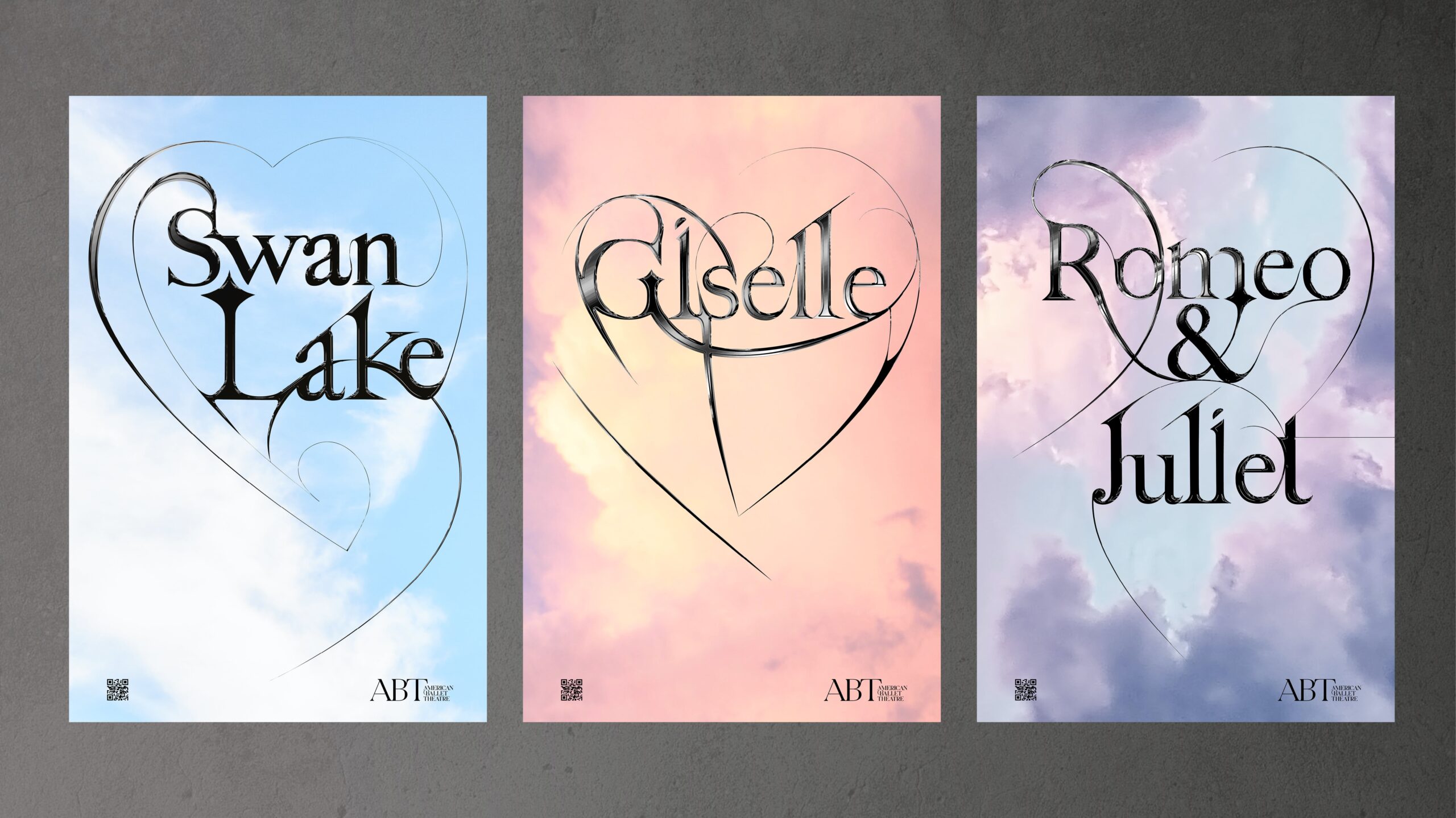
The “American Ballet Theatre Poster Series” is a creative reinterpretation of three tragic love stories—Swan Lake, Giselle, and Romeo and Juliet—through typography designed in the shape of incomplete hearts. These posters were conceived to discover innovative ways to convey these ballet performances’ essence and compelling narratives. To achieve this, I immersed myself in ballet performances, meticulously gathering references from costumes, stage settings, and the graceful movements of dancers.
Through the design process, my goal was to capture the delicate yet strong energy of ballet dancers:
1. Swan Lake: The typography for Swan Lake was influenced by the shape of the swan and features a single, incomplete heart placed out of alignment. This design metaphorically represents a tragic love that remains unfulfilled while also embodying the aesthetic of a beautifully dramatic ballet performance.
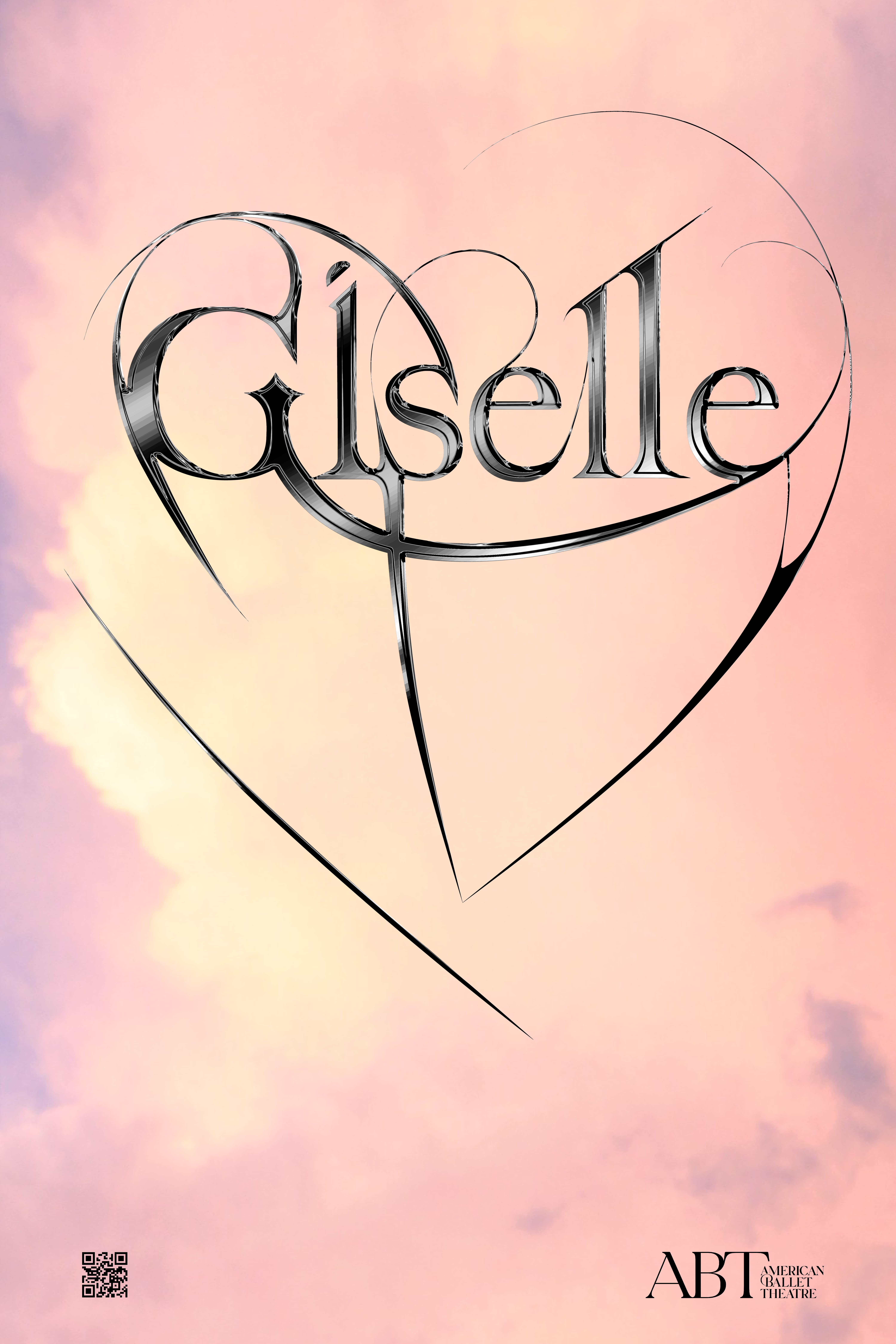
2. Giselle: For Giselle’s tragic love story, I crafted a unique type shape with intersecting details at the center of a heart shape that is not fully connected. This detail symbolizes the corset detail of Giselle’s iconic ballet costume, emphasizing the themes of vulnerability and heartbreak in her narrative.
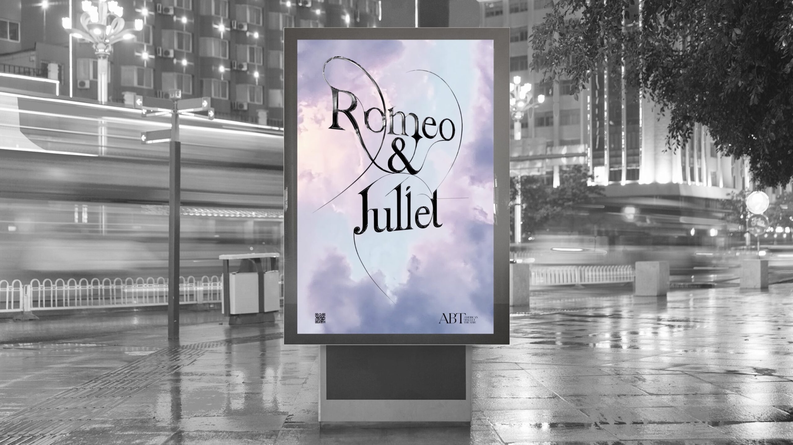
3. Romeo and Juliet: The typography design for Romeo and Juliet features two halves of a heart facing in opposite directions. This design choice directly references the tragic love story of the titular characters, expressing my passion for capturing the essence of their story and the inherent beauty of ballet performances through typographic expression.
In summary, the “American Ballet Theatre Poster Series” aims to reinterpret these beloved ballets visually and strives to evoke the emotions and narratives central to each performance through innovative typography. This project has been a testament to my evolving skills as a designer under Professor Mehl’s mentorship, pushing me to explore new creative avenues in graphic design and typography.
Challenges & Solutions
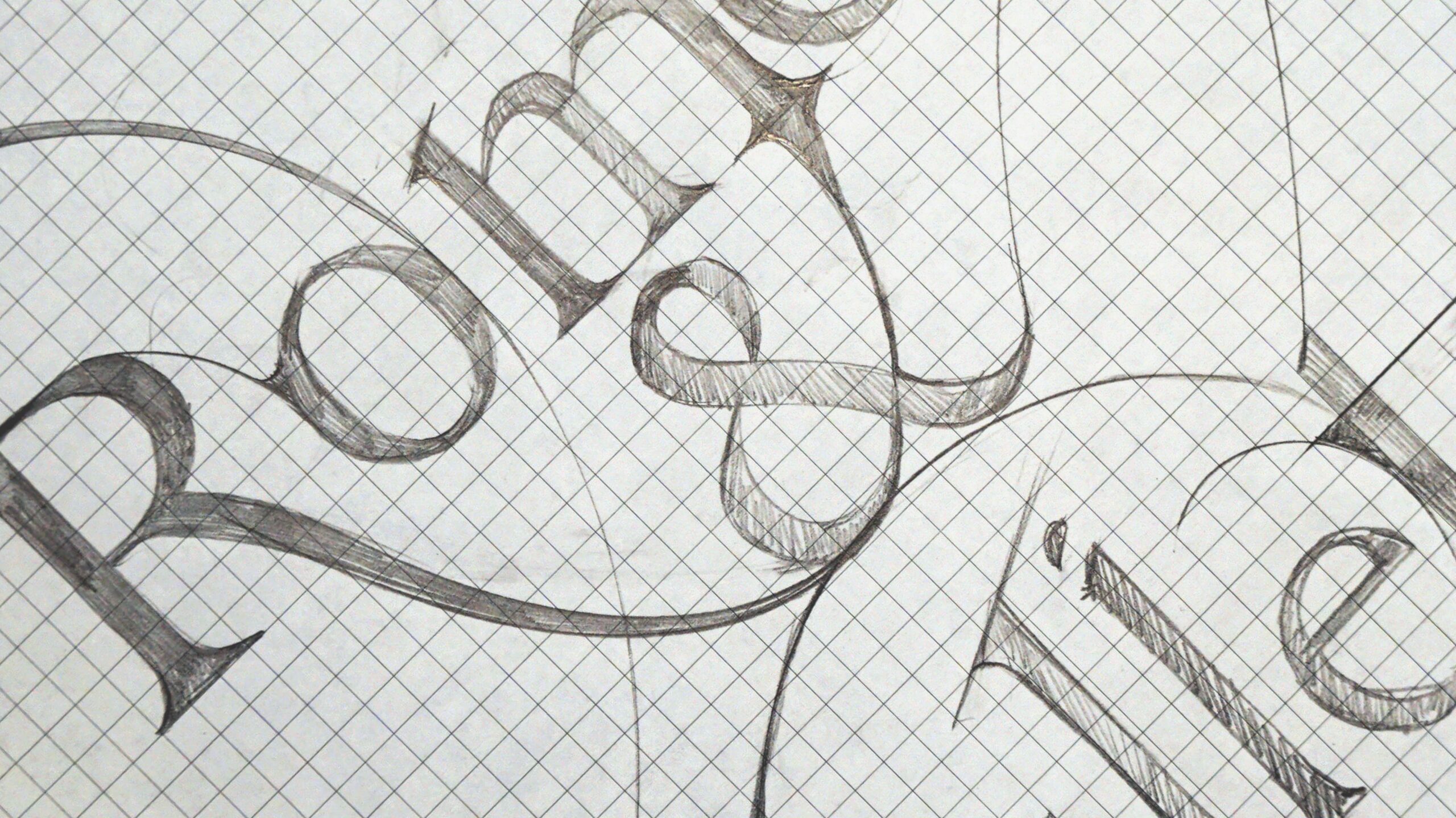
This poster series captivates through its reinterpretation of three distinct ballet performances using typographic design. My journey involved numerous iterations of type design sketches on grid paper, meticulously refined with Adobe Illustrator and Photoshop. At the core of the series is the incomplete heart motif woven through the narratives of Swan Lake, Giselle, and Romeo and Juliet—three tales brimming with emotion and drama.
Each typographic design in the series aspires for perfection, drawing inspiration from the principal characters, their costumes, and the graceful movements of ballet dancers. This approach ensures that every poster captures the essence of its respective story and embodies the aesthetic and emotional depth inherent in ballet performances. Through this process, I aimed to craft designs that resonate deeply with viewers, effectively conveying the beauty and the poignant narratives of these iconic ballets.
My Design Journey
My design journey began at Sangmyung University in South Korea, where I studied scenography. This experience emphasized the collaborative effort required to bring productions to life and highlighted the importance of storytelling in entertainment.
I pursued graphic design in New York, specializing in entertainment-focused design to further develop my skills. Here, I focused on translating intricate narratives into compelling visuals. As a designer, I view myself as a storyteller, aiming to capture the essence of characters and themes to forge meaningful connections through my work.
I am deeply passionate about the transformative potential of design to evoke emotions and foster connections. My journey is fueled by curiosity, creativity, and a commitment to achieving excellence in visual storytelling.
Outcome & Impact
I recently had the privilege of presenting my design research to representatives from the American Ballet Theatre. During the interview, I showcased the innovative concepts embedded in my award-winning projects to marketers and designers within the company. The feedback I received was highly positive, indicating that my work offered fresh ideas and perspectives to the corporate setting.
This experience was pivotal in reinforcing my design aspirations and provided valuable insights into achieving them. Notably, my involvement in designing a poster deepened my passion for typography aesthetics. I have since embraced an experimental approach, particularly in crafting custom typefaces. This initiative has earned recognition for its creativity and experimental spirit from notable figures such as Gail Anderson, chair of the School of Visual Arts, and my professor, Richard Mehl.
With newfound confidence, I am dedicated to advancing my artistic journey and contributing meaningfully to design.
Thanks To
I sincerely appreciate Graphis and all the judges for recognizing the value of my work. I am also grateful to the School of Visual Arts for their guidance and unwavering support in fostering my growth. As a designer, I am committed to sharing my ideas and creations, always striving to offer fresh perspectives in no time. Thank you for taking the time to listen to my story.
Dong Hyun Kim, a Korean design student at the School of Visual Arts, will intern at NBCUniversal in New York during his senior year. His passion for typography earned him the Platinum award at Graphis New Talent 2024 and recognition in the GDUSA Digital Design Award 2024. As a merit scholar, Dong values design history and strives to carry on the dedication of influential artists. He is expanding his skills in motion, branding, and UI/UX, blending Eastern and Western aesthetics. Dong is emerging as a promising designer in New York’s vibrant scene, advocating for people’s diverse forms of beauty.
Discover other New Talent 2024 winners here.
You may also like
The Rum That Wears Its Rainforest Roots by Stranger & Stranger
Multi-Graphis award winner Stranger & Stranger brings decades of spirits branding mastery to the reimagining of Copalli…
Read MorePosters Born From Real Conversation by Pollinate Labs
Awarded Gold in Graphis Poster 2026, Olliday, A Pollinate Event by Pollinate Labs turns conversation into visual…
Read More
Related Annuals & Publications
View AllBecome a Graphis Member
- 1-Year Membership Subscription
- Enjoy 50% off on Call for Entries
- Your Portfolio online with profile + links
- Get 20% off on Graphis Books

