Q&A: Inside Paul Sych’s Timeless Typography
In the world of typography, Paul Sych dances on the edge. A jazz musician turned typographic maestro, Paul doesn’t just use type—he bends it, reshapes it, and coaxes new meaning out of every curve and counterform. His work is as much about sound as it is sight, channeling the improvisational soul of Miles Davis into visual form. Whether he’s curating a fashion-forward visual narrative or distorting letterforms into abstract art, Paul doesn’t follow the rules—he rewrites them, with a wink to the past and a bold stride into the future.
Thirty years into a career that was never supposed to be, Paul’s philosophy is simple: make work that matters. The result? A portfolio that riffs with emotion, layered complexity, and a timeless voice all its own.
In this exclusive Q&A, Paul shares how music shaped his approach to design, why typography continues to captivate him, and what it takes to stay creatively fearless in an ever-evolving industry.
Introduction by Rick Valicenti, Founder & Design Director, Thirst
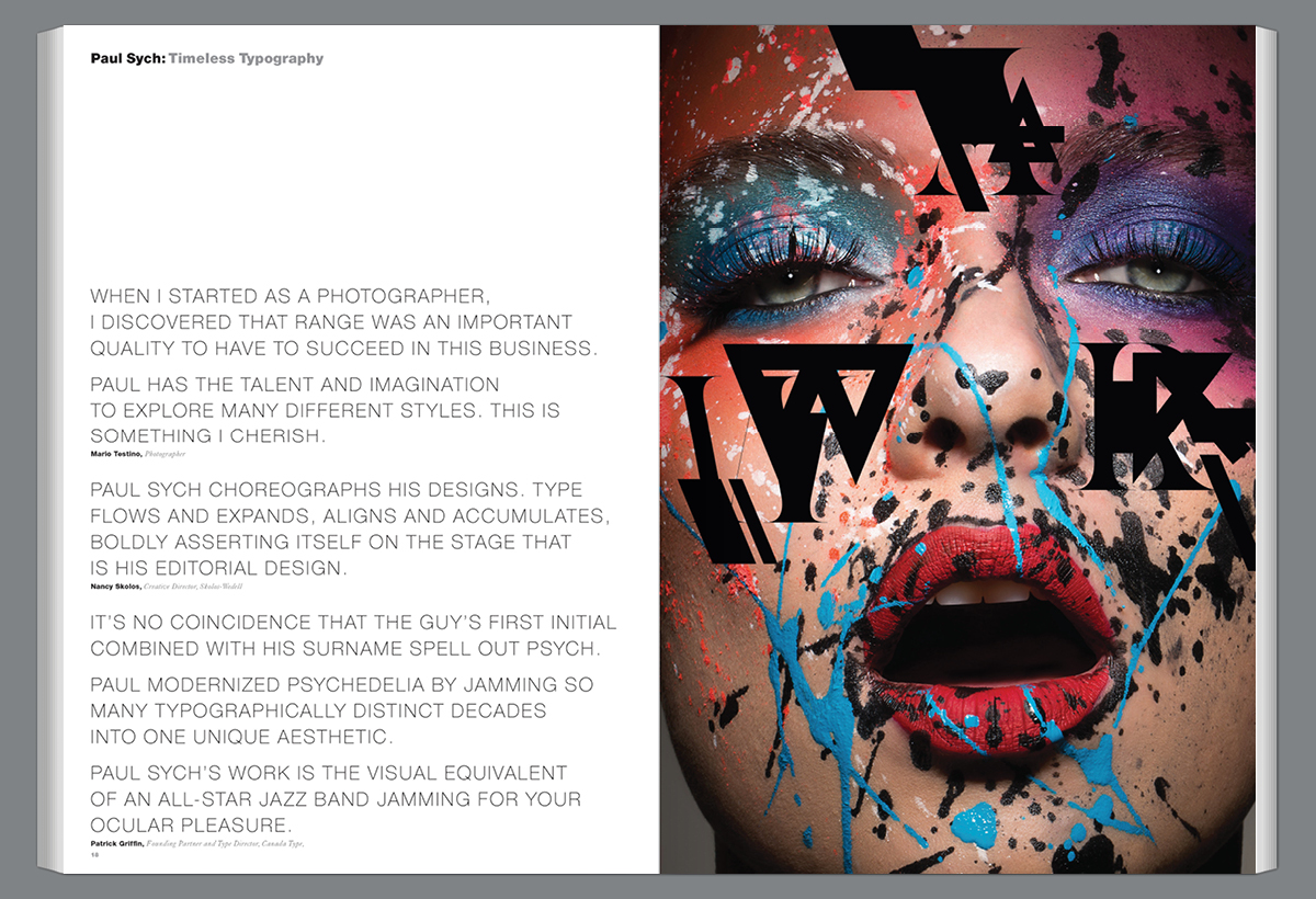
Paul Sych is a Canadian treasure and visibly the modern master of fashionable flourish. Let me be clear: Paul is also a magician who knows how to employ misdirection like no other. Behind the curtain of Paul’s seemingly unbridled graphic hand is a commonsensical mind locked in logic. While his audience sees him at play, his hands and mind are doing the heavy lifting of a journeyman designer. Whenever asked, Paul is able to offer a simple, rational, enthusiastic explanation as to why his deceivingly obvious, deceptively complex graphic gesture works so damn well. It’s easy. Paul’s graphic gestures are essentially from the basic graphic design toolbox—a line here, a bold shape there, a swash, a letterform, a floating counter shape wherever. Once scaled just right or collaged into a perfect union, a visual harmony emerges. Because Paul expertly knows what he is doing, he winks and nods respectfully to past precedents and then turns to his audience, offering a sly new twist, all with the flick of his mouse. Applause fills the air as phone flashlights glitter in the dark. I love how his musical jazz training performs graphic design. In the realm of his editorial design, graphic design converses effortlessly (or so it appears) with adjacent photographic imagery. Both words and pictures riff off of one another in the silence of the printed page/stage—in and out, back and forth, soft and hard, loud and louder. Brilliant shit, maestro!
What inspired or motivated you in your career?
I was a practicing jazz musician after completing my studies in communication arts at the Ontario College of Art and jazz studies at York University. My wife Gillian had been working as a graphic designer for four years and was about to get hired as the art director at a print shop on one condition—they would hire me as a delivery driver/production artist. We got the job.
What is your design philosophy?
My design philosophy is that designers should consider the future when creating. We have a limitless opportunity and responsibility to create work that engages, promotes thought, and ultimately emits meaningful and emotional experiences.
What specifically attracts you to typography design?
Its complexity and its simplicity. When I begin a typographic assignment, I look for shapes and forms to exaggerate, distort, and fragment, thus creating a new language and visual sound.
Where do you seek inspiration?
My inspiration is centered on art and music. Miles Davis, John Coltrane, Bill Evans, Jean-Michel Basquiat, Man Ray, Jack Bush, Wassily Kandinsky, and James Rosenquist.
Who were some of your greatest past influences?
Alexey Brodovitch, Helmut Newton, Mario Testino, Guy Bourdin, Lester Beall, Alvin Lustig, Paul Rand, and Max Huber. They still influence me today. Their work is profound.
Tell us about your project, Fshnunlimited.
Fshnunlimited (FU) began as a collective archive of Canadian creativity in fashion, art, design, and media. It was produced seasonally in the spirit of collaboration and community. The magazine’s visual narrative reflected the artists, photographers, writers, designers, illustrators, and painters who joined together to build it. I saw my role not as an art director/designer but more as a curator.
What are the most important ingredients you require from a client to do successful work?
Patience and trust. A reciprocal sharing of ideas.
What is your greatest professional achievement?
Sustaining my design practice for over 30 years and being asked to teach design and typography at York University in Toronto. I became an associate professor in the Department of Design in 2013. In 2016, I was the recipient of York University’s Research Excellence Award.
What is the greatest satisfaction you get from your work?
The discovery of something new, deliberately or by mistake.
What professional goals do you still have for yourself?
Many. I would love the opportunity to broaden my scope and experiment with different media, i.e., film and motion.
What advice would you have for students starting out today?
Be brave, and don’t lose sight. Nurture your own visual voice and be a collector of all things. I designed a poster 20 years ago that read “Become, Became, Be” with this in mind.
Who among your contemporaries today do you most admire?
I’ve always admired Fabien Baron. His typography is exquisite and executed with such care, precision, and abstraction.
Another contemporary is Rick Valicenti from 3st in Chicago. During my first job as a graphic designer in 1988, I saw his work in a design publication and was immediately attracted to it. His work was a departure from any other graphic design that I had seen before. It was playful and intellectual and contained depth and integrity merged with soulfulness. I wasn’t sure what made me enjoy his work so much until I met Rick for the first time. His lectures were contagious and filled with intrigue, wisdom, and truthfulness. Rick’s work challenged me to look deeper into his unique abstract visual language.
How do you define success?
Staying relevant and being happy with what you do.
Who is or was your greatest mentor?
The late jazz pianist Bill Evans. As a jazz guitarist early in my career, I listened to Bill Evans a lot. He had such a beautiful sound and incredible virtuosity. His phrasing and lyrical playfulness were infectious, and I could not resist the temptation to transcribe some of his solos and his complex harmony.
What is the most difficult challenge you’ve had to overcome?
Making the transition between music and design. I never wanted to be a graphic designer in my early twenties; I wanted to be a musician. During that time, I worked full-time as a production artist, and in the evenings, I would perform and rehearse.
What would be your dream assignment?
To work with the Peruvian fashion and portrait photographer Mario Testino.
Who have been some of your favorite people or clients you have worked with?
When I started my design practice in 1989, I designed a self-promotional book that featured some of my custom idiosyncratic/geometric letterforms. The book caught the attention of FontShop in Germany, and they invited me to design some fonts for the FontFont label. Later, in 1990, I was invited by Jon Wozencroft and Neville Brody to design a font and poster for the quarterly magazine FUSE in London. In 1992, I was commissioned to design the section opener pages for FontShop’s FontBook catalogs, and I was introduced to many renowned typographers from FontShop, such as Erik Spiekermann, Just Van Rossum, Erik van Blokland, and Max Kisman.
What part of your work do you find most demanding?
The business side.
What interests do you have outside of your work?
Still perfecting my jazz studies.
What do you value most?
My wife, Gillian. I would never be where I am today if she hadn’t forced me to take that delivery driver job at a small print shop in 1985. She is my best advocate.
What would you change if you had to do it all over again?
Nothing, I’m quite content. I’ve exceeded beyond my expectations given that I knew nothing about design or typography.
Where do you see yourself in the future?
Art directing more fashion, designing more typefaces, and being more expressive.
Paul Sych is the founder of the creative design agency Faith. As a typographer, designer, and art director with an expanse of diverse experience, Paul’s core sensibilities and vision are built upon pillars of discovery, innovation, and imagination—cultivating Faith into both a think tank and a platform for boundary-pushing, neoteric design on multiple digital and tangible channels. Led by a penchant for distinctive typography and hand illustration, Paul’s unique approach to language and imagery has forged brand identities of compelling visual character and bold presence, manipulating the retention of concepts, ideas, and words in a company, piece, or publication. Paul’s work has been widely celebrated over the course of his career, leading to over 100 international design, art direction, and typography awards and accolades since his appointment as associate professor at York University in 2013. His body of work has been published in over 120 books and publications internationally.
Social: Instagram, Facebook, LinkedIn, X
Discover other creatives in the Graphis Journal #359, available in our store.
You may also like
Antonio Castro H and the Beauty of Overlooked Species
Awarded Gold in the Graphis Poster Awards 2026, One World / One Chihuahuan Desert is a poster…
Read MoreThe Story Behind PPK’s Head-Turning Poster Campaign
PPK’s creative team has long partnered with Big Cat Rescue to craft campaigns that combine emotional storytelling…
Read More
Related Annuals & Publications
View All


Become a Graphis Member
- 1-Year Membership Subscription
- Enjoy 50% off on Call for Entries
- 1-Year FREE Subscription to Graphis Journal
- Your Portfolio online with profile + links
- Get 20% off on Graphis Books