How Elmwood’s Symbol Redesign Made Extra Click with Gen Z
What do you do when a brand's most recognizable symbol has become its biggest liability? When Mars Wrigley approached Elmwood to rebrand Extra gum for younger audiences, they inherited a "static and graphically out-of-place" ding symbol that screamed outdated rather than confidence. But instead of scrapping it entirely, the London-based consultancy saw an opportunity hiding in plain sight. Through strategic research into Gen Z's key confidence moments—from styling up for a night out to navigating single life and dating—they discovered that this forgotten little ding could become the foundation for an entirely new brand universe. The result? An award-winning transformation that proves sometimes the smallest design elements can carry the biggest brand stories.
For as long as we can remember, gum has been linked to confidence. Comms have focused on this but, until now, it’s never been baked into the wider brand experience. So, when Mars Wrigley first approached us to rebrand Extra and their chewing gum products (also known as Orbit, Yida or Freedent globally) and help them appeal to a younger audience, we saw an opportunity to create a brand that embodied confidence, putting the ding symbol front and centre in a way that sends a powerful message for a digital-first generation… simple, iconic and in a way that can be activated. Our ambition was to transform Extra into an iconic lifestyle brand and place it at the heart of everyday living for a younger audience and into the Gen Z lifestyle, encouraging confidence in the moments that matter to them. Together with Mars Wrigley we commissioned research about this group of consumers and the results revealed a series of key moments around ‘styling up’ and ‘single life/dating’ that provided the perfect platform for the rebrand.
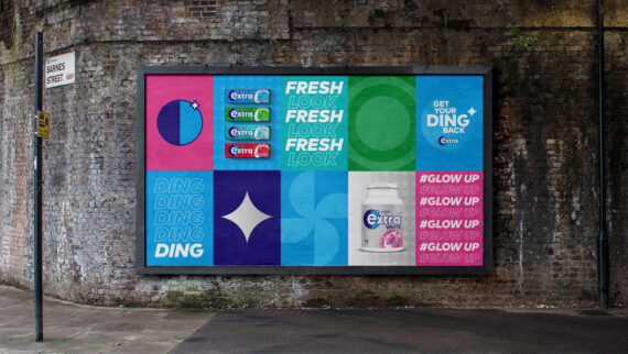
To access this platform, Extra needed a new universal brand flag. The old one featured a static and graphically out-of-place ‘ding’ that represented a missed opportunity. Imbued with softened curves and a simplified yet eye-catching look, we created a new ding icon that would inform and inspire the shape language of the entire brand identity. We set the ding beside a rounded shield shape, highlighting the letter ‘e’. This shape is also used alone as a universal, shorthand icon for all global territories. It embodies its identity and brand personality without the need for copy. As a symbol for confidence, the brand flag and its shape language of circles and dings has been baked into every visual element of the packaging - from the typography on the pack to the illustrations for the multiple flavors. Extra now has a versatile brand system that can flex across all touchpoints, giving it new life beyond its packaging and allowing the brand to appeal to a digital-first mindset.

Extra has evolved into a confident, forward-thinking brand that captures a younger, emboldened, and contemporary feel - while staying true to its brand heritage. The global rebrand began its rollout in December 2021 in China and will continue over the coming year with the full family of Extra products in the UK followed by a world-wide rollout. Crucially, the refreshed brand has provided a system that can be flexed and evolved to allow for new product innovations and partnerships. Most recently, Extra used the rebrand to launch a cross-promotional campaign via a partnership with Gen-Z focused online fashion retailer, I Saw It First.
About Elmwood
Elmwood is a globally recognised, award-winning strategic brand design consultancy that builds brands with intent. From studios in London, New York, Singapore and Shanghai, we partner with ambitious companies to create brands that’s are more meaningful, more memorable, and ignite more momentum. Our approach — The Elmwood Way — brings clarity, creativity and intent to every step of brand building. As part of MSQ and a certified B Corp, we help shape some of the world’s most influential brands, including Unilever, Heineken, Coca-Cola, Haleon, Danone and Mars.
Related Annuals & Publications
View All


Become a Graphis Member
- 1-Year Membership Subscription
- Enjoy 50% off on Call for Entries
- 1-Year FREE Subscription to Graphis Journal
- Your Portfolio online with profile + links
- Get 20% off on Graphis Books