Opera Meets Avant-Garde in Stephan Bundi’s Poster Art
Swiss designer Stephan Bundi, the creative force behind Atelier Bundi AG, continues to push the boundaries of communication design with his award-winning projects for Sommeroper Selzach and Theater Orchester Biel Solothurn. Honored with Platinum and Gold awards, Stephan’s poster designs for “Carmen” and “Cyrano” masterfully intertwine visual storytelling and conceptual depth. In his bold approach, the fatal wound in “Carmen” transforms into a visceral trompe-l'œil effect, while “Cyrano” evokes the tragedy and wit of Edmond de Rostand’s iconic character. Renowned for his process-driven philosophy, Stephan sees design not as decoration but as an intellectual pursuit, crafting narratives that resonate with audiences while honoring the avant-garde spirit of opera and theater.
By: Stephan Bundi, Designer & Art Director, Atelier Bundi AG
Carmen
Carmen is an opera in four acts by Georges Bizet, premiering in 1875. The story takes place in Spain and tells of the passionate and free-spirited gypsy Carmen, who seduces the soldier, Don José. Don José cannot resist her allure, abandons his duties, and becomes embroiled in a tumultuous conflict due to Carmen’s independence, which tragically ends when he fatally injures her—a brutal femicide.
I found inspiration in the work and its central message regarding femicide. While working on the poster, I wondered how this alarming murder could be visualized without the poster becoming off-putting. The fatal knife wound spans the entire surface of the poster and is positioned in such a way that it suggests Carmen’s injury while simultaneously making the poster itself appear to be cut. This trompe-l'œil effect can only be effectively showcased on an out-of-home medium to disturb the viewer. At first glance, it remains unclear whether the poster has been slashed or if it is a symbolic representation. Such “stumbling moments” are known to stick better in recipients’ memory, thereby increasing the advertisement’s effectiveness.
Cyrano
Cyrano is a tragicomedy by Edmond de Rostand. The nobleman Cyrano de Bergerac is mocked for his large nose. His poems, however, are deeply touching, yet he gives them to his rival, who uses them to woo the beautiful Roxane, who both men desire. It is a play with masks, hide-and-seek, and deception.
Like with Carmen, I drew inspiration from the work to develop the poster design. From conception through design to implementation, I create my projects myself and try to highlight what is special and unique about them. Love and death are central themes in 90% of all operas and dramas. However, working with just one symbol for love (heart) or death (skull) is insufficient. Therefore, I consider how the specific theme can be visually represented. Often, I can find or develop a visual metaphor that I can use. This poster was awarded the Red Dot Award for Best of the Best.
In communication design, I believe that thinking and implementing are inseparable processes; what is conceived must be evaluated for its effectiveness during the design phase, rethought if necessary, and better enacted. Designing, reviewing, rethinking, optimizing—this process-oriented approach is necessary to develop an optimal solution from a design perspective. I can make changes regarding form, color, and font in each design phase until the design “rests in itself.” This internal dialogue cannot (yet) be conducted with AI, or it becomes extremely exhausting, complicated, and consequently unproductive.
When clients do not approach me directly based on my work, the biggest challenge in handling projects is convincing them. Particularly in opera, I primarily work with individuals who tend to act from a more traditional perspective due to their professional orientation. In contrast, the composers and authors of their time were considered avant-garde. I feel committed to them, as it is their work that I visually interpret. Therefore, I see my responsibility less with the client and more with the work’s creator—the composer and the author. If a valid solution arises from this approach, it also appeals to the target audience, as they are primarily interested in the work itself.
My best clients have always come to me because of my work since intelligent, successful clients not only need my design but also value my thought process and ideas. Therefore, presenting a design only to the responsible person is essential.
As mentioned before, I am committed to the creator of a work. Many of these poets and composers are no longer with us, and their judgment can no longer be obtained. However, contemporary artists, directors, authors, and musicians have often and explicitly expressed their gratitude for my work. I also feel a responsibility towards the target audience—the visitors and the general public—because they fund the subsidized institutions. A good poster is a significant contribution to the visual cultural landscape of a city.
Significant awards are important to me because they have made my work and me as a designer better known, attracting demanding clients. A good piece of work does promote itself, but an award represents an objective proof of its quality. For example, my poster “Stop Torture” was published in the Graphis Poster Annual 1986. Subsequently, I received a letter from the Museum of Modern Art in New York requesting that I donate the mentioned poster to their collection.
Money should never be the motivation for pursuing a design career. Like freelance artists, the desire to create and the need to make oneself or a product visible with a visual idea must take precedence. Those who work with joy will find that a good income is a pleasant side effect.
My attempts with AI have shown me that while much is possible, only some things are. AI is a brilliant computing system that can think vertically but never laterally (creatively). Developing and creating a good, surprising, and unusual visual idea will remain crucial in the future to whether we, as designers, are commissioned and can be successful. We refer to our activity as visual communication, not visual decoration.
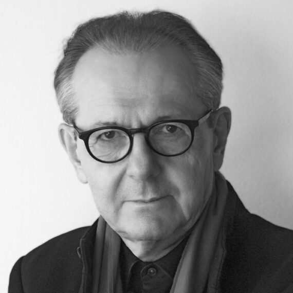
After completing his graphic design studies in Switzerland and at the State Academy of Fine Arts in Stuttgart, Stephan Bundi founded his own studio in Bern.
As a designer and art director, he works for film producers, concert organizers, museums, theaters, and publishers, merging unconventional ideas with practical Swiss design traditions.
He prefers to develop projects independently, allowing the creative process to unfold without interruption. He views successful design as a process in which thinking, creating, and rethinking continuously alternate until the final print-ready version is completed. He has received well over 100 Gold and Grand Prix awards at international design biennials.
Check out our other Poster 2025 winners on our website!
You may also like
Antonio Castro H and the Beauty of Overlooked Species
Awarded Gold in the Graphis Poster Awards 2026, One World / One Chihuahuan Desert is a poster…
Read MoreVisualizing Climate Impact in Unexpected Hues
Gold in the Poster Awards 2026, Franziska Stetter’s Unexpected Hues – Human Impact on Ocean Colors turns…
Read More
Related Annuals & Publications
View AllBecome a Graphis Member
- 1-Year Membership Subscription
- Enjoy 50% off on Call for Entries
- Your Portfolio online with profile + links
- Get 20% off on Graphis Books

