Behind The Creative Layers of Poland’s Rymkiewicz Festival Posters
During the early stages of designing the promotional posters for the Festival Rymkiewicz, a cultural festival steeped in themes of death and the afterlife, Katarzyna Zapart found herself toying with medieval Danse Macabre motifs, yet something was missing. The breakthrough came during a train ride to Krakow, where she envisioned merging human elements from historical paintings and photographs with the marbled paper of old book covers, symbolizing the intersection of life and death. This approach transformed the festival’s visual identity into a haunting yet elegant narrative, where the imagery served as an X-ray, revealing skulls, bones, and surreal scenes beneath the surface. The result was a Graphis Poster 2025 Platinum Award-winning series that honored the dark fascinations of the festival’s namesake Polish poet while turning them into a visually intriguing celebration of cultural heritage.
By: Katarzyna Zapart, Freelance Designer
One of the most curious aspects of designing is inspiration. One day, you work like a machine, and all you touch becomes gold; another day, you do projects that bring nothing but shame to the human race (or at least that’s how it feels). Usually, I go through both stages while working on a project. It wasn’t much different with the Rymkiewicz Festival.
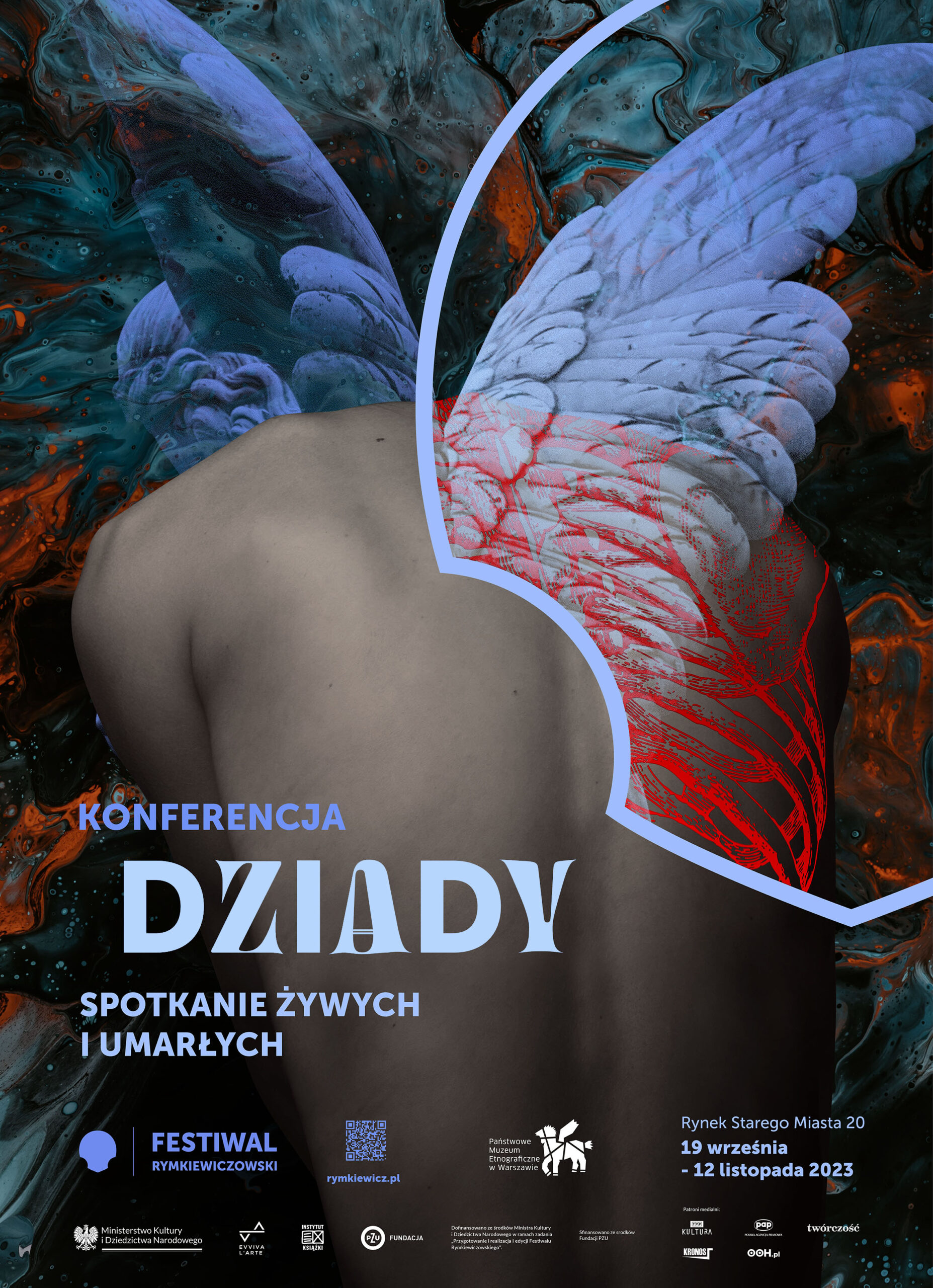
The email with a collaboration proposal came just in time. I was living in Barcelona, and even though I loved the place, I started feeling a bit homesick and missing Poland. The Rymkiewicz Festival is a series of cultural events connected to poetry, theater, music, etc. The idea is very much rooted in Poland. Jarosław Rymkiewicz was a remarkable Polish poet and a patriot. The first-ever festival was also connected to another person: Adam Mickiewicz, the legendary Polish poet from the 19th century. What connects these artists? The death motif: Rymkiewicz was obsessed with it, and Mickiewicz left a big masterpiece called Dziady, a four-part poetic drama about an ancient Slavic ritual connected to “feeding” the souls of the dead. The title of the first edition of the festival was “Dziady, Upiory, Przodkowie,” which means “dziady (the ritual), ghosts, ancestors.” My task was to design the logo, visual identity, and the posters.
At first, I got stuck with the Danse Macabre motif. My computer was loaded with medieval images of dancing skeletons, and my mind was filled with nostalgia. It was beautiful. But how to utilize it? How do you mold it into a big project containing many events? Should I make all the dead poets dance? The clock was ticking, the deadline was approaching, and I had nothing but skeleton musicians in my mind.
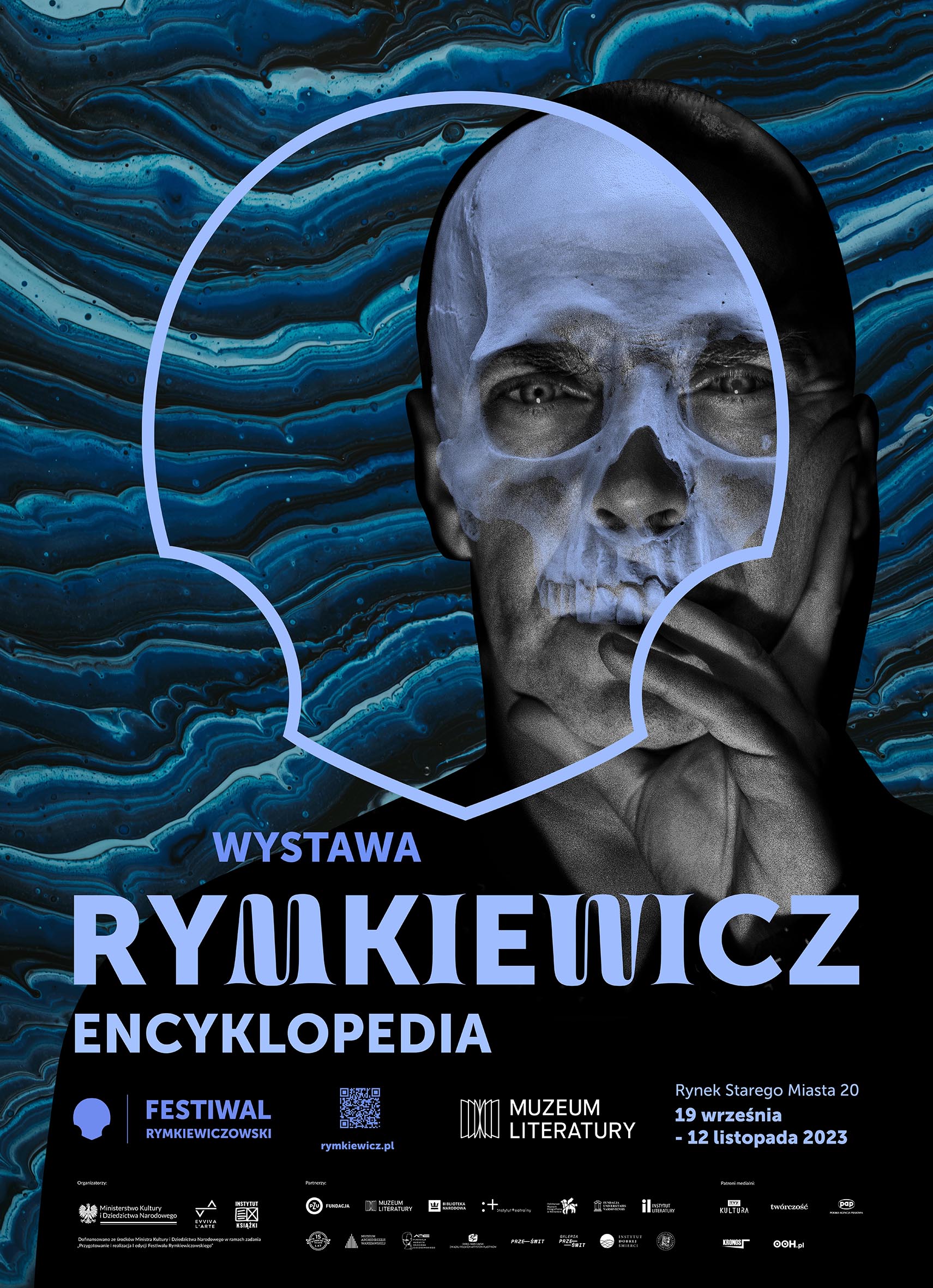
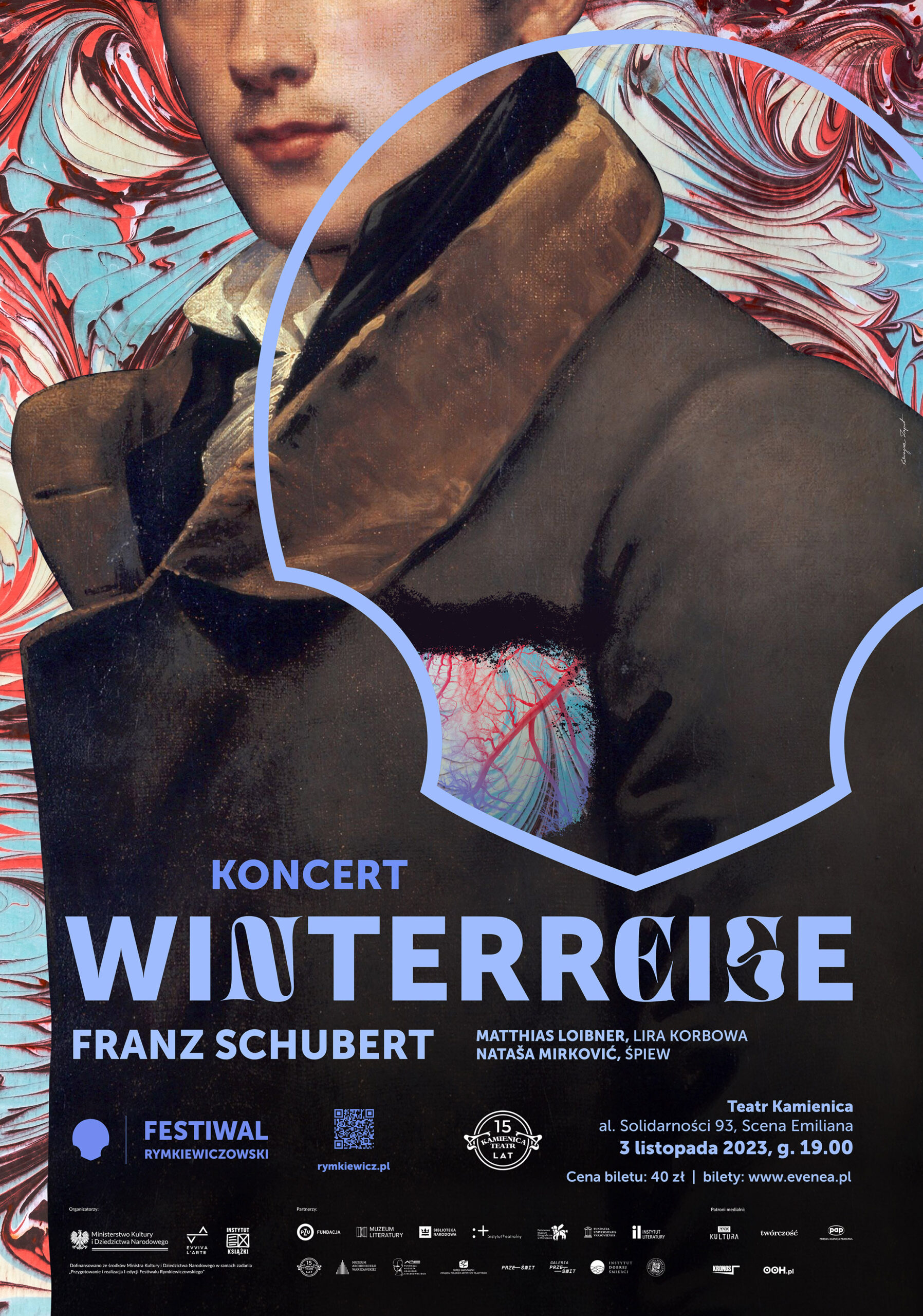
Inspiration came unexpectedly. I was on an old train going to Krakow. No internet, no power sockets. These circumstances forced me to focus more, and new ideas finally came to mind. I thought about using the logomark (which has the shape of a skull) as an x-ray and partially transform the poet’s face into a skull. Looking at the digital copy of one of the first prints of Mickiewicz’s Dziady, I thought marbled paper would serve as a great background. The poster was ready before I arrived in Krakow. That’s the story of the first one of the series, the one advertising exhibition: “Rymkiewicz. Encyklopedia.”
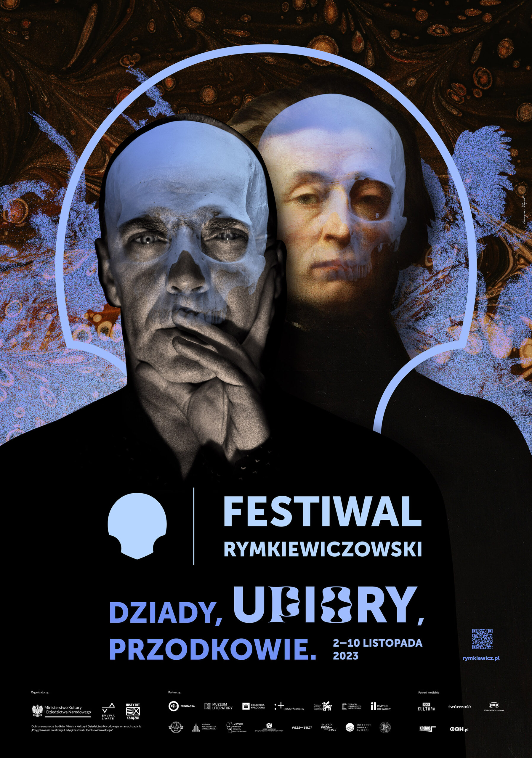
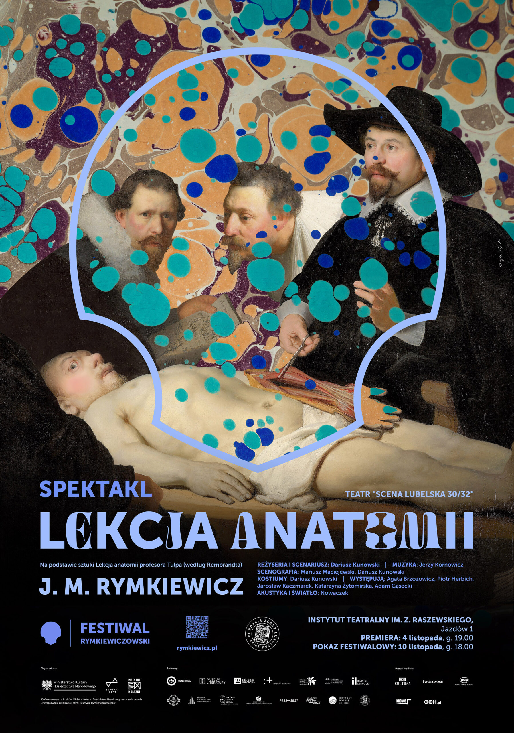
I sent it to the client immediately, and the response came quickly. It was affirmative. After struggling a little with the fonts, the first poster and the style were accepted. The logomark shape became the scene of unexpected phenomena for all posters.
Sometimes, the most challenging part of the project is the client. That was not the case. Izabela Michalska, the owner of the Evviva L’arte Foundation (the festival organizer), was highly open-minded and willing to collaborate. All the comments and tips were substantive, so I never struggled with long correction processes, and the client and I ended up happy with the results.
Cultural projects give much more creative freedom than “business” ones. The audience is more open, artsy, and prone to understanding metaphors, so the designs resonate with them.
Even though I don’t have clear, scientific, data-driven stats to prove that the design worked, I can say that the organizers were pleased with it. I have already been asked to design the main poster for the next festival, so I daresay that the design worked!
To sum up, I am grateful for the chance to collaborate with such a good client on such a meaningful project. Receiving the highest prize from a prestigious organization such as Graphis upgrades its status and stabilizes a volatile feeling of satisfaction.
Katarzyna Zapart is a Polish graphic and poster designer. She is a graduate of the Academy of Fine Arts in Krakow and a participant in poster exhibitions and publications from Japan to the Americas; she has won four Platinum and three Gold Graphis Awards. Katarzyna is a self-employed designer who creates logos, websites, and other designs. Her favorite thing to work on remains the poster, primarily cultural ones, which seems to be the most artistic design field. Her favorite part of the creative process is transferring a story or information into a visual metaphor.
Social: Instagram, Facebook, LinkedIn
Check out other Poster 2025 winners here!
You may also like
Visualizing Climate Impact in Unexpected Hues
Gold in the Poster Awards 2026, Franziska Stetter’s Unexpected Hues – Human Impact on Ocean Colors turns…
Read MoreThe Rum That Wears Its Rainforest Roots by Stranger & Stranger
Multi-Graphis award winner Stranger & Stranger brings decades of spirits branding mastery to the reimagining of Copalli…
Read More
Related Annuals & Publications
View All


Become a Graphis Member
- 1-Year Membership Subscription
- Enjoy 50% off on Call for Entries
- Your Portfolio online with profile + links
- Get 20% off on Graphis Books