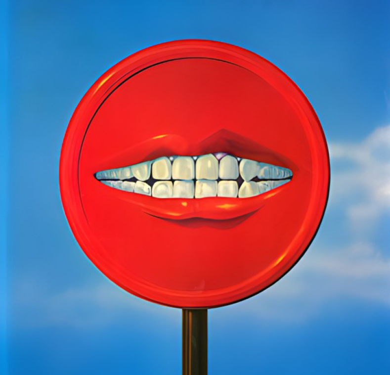
Uncover the Hidden Layers in João Machado’s Award-Winning Posters
João Machado, a celebrated Graphis Master, has once again pushed the boundaries of poster design with his award-winning pieces, “Shoe Design” and “Water,” which earned him Platinum and Gold honors at the 2025 Graphis Poster Awards. Known for his signature style of intricate geometric compositions, João’s work dives deep into symbolism and layered meanings, as art curator António Augusto Joel uncovers in his analysis of each poster’s hidden messages. João’s “Shoe Design” plays with form and motion, evoking artistry and human craftsmanship. At the same time, “Water” subtly weaves in trios of shapes and symbols, hinting at balance, nature, and spirituality themes. These posters are a testament to João’s ability to merge visual beauty with profound messages, inviting us to see more than meets the eye.
By: António Augusto Joel, Art Curator
João Machado, a Graphis Master, often chooses geometrical figures as order tabulators in posters which are a trademark in his work. Sometimes, the intertwining of such figures conceals less evident symbols, slightly obliterating their subtle meanings. Such is the case with posters like “Shoe Design” and “Water,” distinguished, respectively, with Platinum and Gold Awards from the 2025 Graphis Poster Awards.
Shoe Design
The “Shoe Design” poster follows a geometric compositional trend, featuring circles, triangles, rectangles, and even suggesting a square in the yellow background. Undeniably, it evokes two other famous posters designed by João Machado relating to shoes; the 1993 and 1994 Prémio Nacional de Design de Calçado, where triangles also assume a central role in the geometrical composition.
Furthermore, it must be noted that the missing section of the circle drawn against the black rectangle apparently represents a sixth of a circle, thus evoking a triangle and half a vesica, a shape which is also suggested by the external curved line drawn by the moving shoe and, again, by its upper curved red side.
Besides an obvious innuendo relating to the compass leg, the representation featured here may not just refer to movements by a ballerina or a tap dancer, but may also represent human intervention in the industrial production process, which, combined with a mechanized one, may evolve to bionics.
Following the action and movement of the compass, a masonic symbol together with the set square, which meaningfully may also be called a triangle, leads us to the combined importance, in the act of creation, of what stands still—the inner leg, and of what moves—the outer leg that draws a circle. This may be the genesis of a singular imaginary cosmos, well
beyond the literal meaning of what we usually see or read, very much as the circle projects itself outside the frame and what may be seen inside the material limits of this poster.
Throughout his work and art, João expresses all his environmental, political, and social concerns regarding the actual condition of humankind. Such views are translated in superb combinations of geometric shapes and colors, becoming then portals to matters, signs, and symbols that may not be so explicit at first glance.
Water
Although the number three is not explicitly featured in the poster “Water,” its value spans through all its architecture, not just one, but three times—three black triangles, three circles, and three fishes. Through lateral thinking, the designer departs from these trios to propose a glimpse of another reading level. In a way, considering the background color of this poster, one may also recall the lyrics of Johnny Nash: “Look all around, there’s nothing but blue skies,” adding that, in fact, something else might be here.
Besides suggesting shoaling, the three fishes suggest elongated versions of vesica piscis, which in their original form are based on two equilateral triangles and four curves, each one being equivalent to a sixth of a circle. This not only plays with a lexical pun for fish bladder but also with its hidden meanings, like the ichthys symbol for Christ, and his fishermen apostles, the masonic divine glory, or, when the two triangles inscribed in a vesica are considered, the duality of what is above or below, what is divine or human. Moreover, the different positioning of the three circles resembling eyes—two lateral, one central, not only suggest a triangle but may also stand as a statement for biodiversity.
Finally, the void surrounding the black triangles, which bring unity and balance to the composition and drive the viewer’s attention to what lies inside, suggests a “W” that may stretch towards the outer margins of the poster and beyond, connecting the inside and the outside of it. Obviously, the same way as the vesicas, which can be seen as representing sections of circles that expand way beyond the limited inner frame of the poster. To overcome too much of a symmetrical compositional approach and to add some depth by suggesting different layers in the background, some bottom intertwined wavy lines are depicted. These resemble intaglio printing lines made by a burin, a resource that the artist also used in other water-related works, notably featured in a koi carp for the 2017 Ogaki Matsuri Festival poster.
Quoting Johnny Nash once again, we can see clearly now that João Machado’s creations offer way more than what could just be seen in the beginning.
João Machado studied sculpture at ESBAP-Portugal, but it is in graphic design that he is internationally recognized. He opened his own studio in 1981, and since 1983, he has exhibited his work and won several awards, such as the Icograda Excellence Award. His passion for poster design is well-known, and he also works in editorial design in the areas of illustration and philately, always marked by an identity that has been persistently built.
Check out our other Poster 2025 winners on our website!
You may also like
The Rum That Wears Its Rainforest Roots by Stranger & Stranger
Multi-Graphis award winner Stranger & Stranger brings decades of spirits branding mastery to the reimagining of Copalli…
Read MoreVisualizing Climate Impact in Unexpected Hues
Gold in the Poster Awards 2026, Franziska Stetter’s Unexpected Hues – Human Impact on Ocean Colors turns…
Read More
Related Annuals & Publications
View AllBecome a Graphis Member
- 1-Year Membership Subscription
- Enjoy 50% off on Call for Entries
- 1-Year FREE Subscription to Graphis Journal
- Your Portfolio online with profile + links
- Get 20% off on Graphis Books

