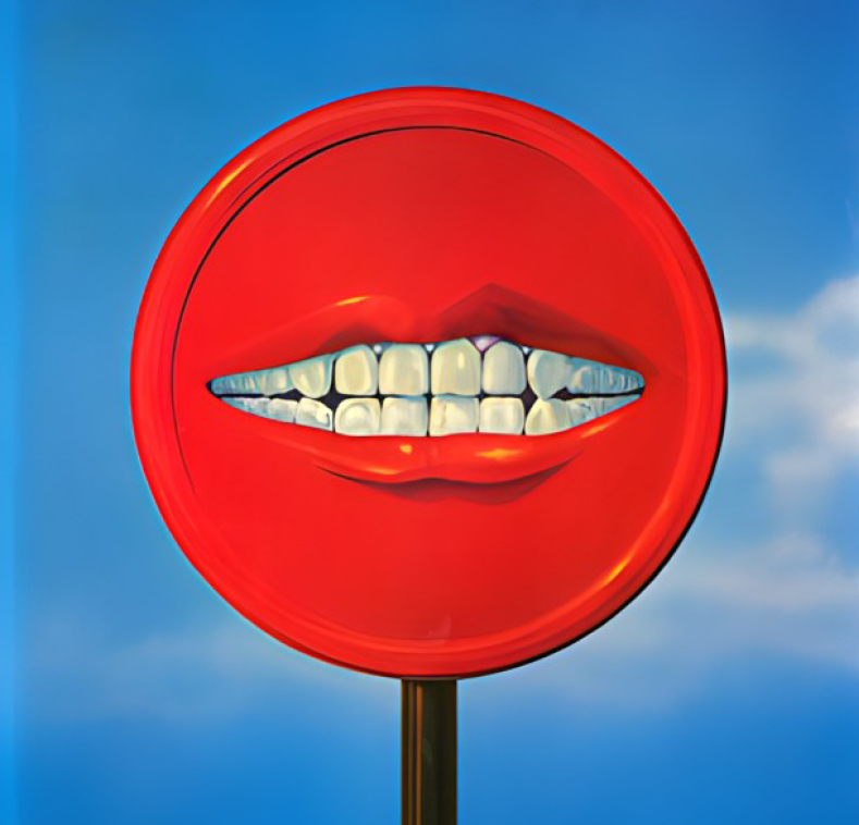
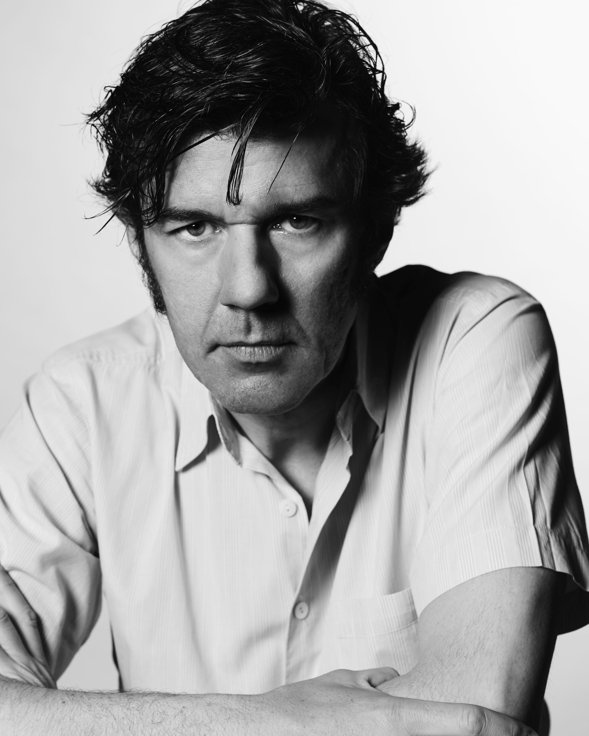
Typography, Truth, & Taking Sabbaticals: Stefan Sagmeister Speaks
Few designers have pushed the boundaries of visual communication with as much boldness and originality as Stefan Sagmeister. The Austrian-born, New York-based graphic designer has created iconic album covers for Lou Reed, the Rolling Stones, and David Byrne, while his provocative exhibitions and personal projects—including his famous nude self-promotional postcards—have challenged our understanding of what design can be. His work spans commercial projects, exhibitions, and social experiments that often explore the intersection of art, design, and human happiness. Known for taking regular sabbaticals to rejuvenate his creative process, Stefan’s distinctive approach has earned him two Grammy Awards and virtually every major design accolade. In this candid conversation, we explore the philosophy and creative methodology of one of the most influential designers of our time.
Introduction by Jessica Walsh, Creative Director & Founder, &Walsh
Stefan Sagmeister blurs the boundaries between art, design, and philosophy. Known for his provocative and thought-provoking approach, Stefan has redefined what it means to be a graphic designer and is an icon in the industry. His projects, ranging from album covers and immersive exhibitions to art projects, challenge conventions while exploring deeply human themes like happiness and self-reflection. He transforms design into an emotional experience. He has a fearless approach to merging personal and professional creativity. Simply put, there’s no one quite like him, and it was an honor to collaborate with him for so many years!
Your work is renowned for its ability to transform complex ideas into compelling visual narratives. What drives your creative process when tackling such profound themes?
It occurred to me during my first sabbatical that I should try to use the language of communication design in areas that are not promotional. The first large project that came out of that thought was the “Things I’ve Learned in My Life So Far” series. As there was a lot of positive feedback, I continued looking for other areas to explore.
If you were to summarize your design philosophy in one sentence, what would it be?
I’m trying to create work that helps and delights people.
You’ve built a career on challenging conventions and provoking thought—what’s the most significant risk you’ve taken in your work, and how did it shape your perspective as a designer?
My first sabbatical. Actually, doing it after building a studio for the previous seven years was very scary; I truly needed to overcome that fear. Sabbaticals ensured that I could continue to see my work as somewhat of a calling instead of a career or a nine-to-five job.
What question do you feel most encapsulates the essence of your work?
Is it possible to touch the heart of the viewer with design?
How has your understanding of design evolved throughout your career?
Form and beauty took on a completely new importance. When I started out, the only things important to me were the idea and the concept. Over time, I understood that everything works much better when I take the form (and the color, the composition, the shape, and the materiality) seriously.
Is there a single moment or project in your career that you see as a turning point?
For someone on the outside, maybe the series “Things I’ve Learned in My Life So Far” because it is firmly rooted in graphic design and, at the same time, deeply personal. For myself, defining moments are always the things I’m working on right now, like “The Beautiful Numbers” series that deals with long-term thinking.
If I look at developments concerning the world from a long-term perspective—the only sense-making way—almost any aspect concerning humanity seems to get better. Fewer people go hungry, fewer people die in wars and natural disasters, and more people live in democracies—and live much longer lives—than ever before. 200 years ago, nine out of ten people could neither read nor write; now, it is just one out of ten. The goal behind these visualizations is that viewers might want to place them in their living rooms as reminders that the latest tweets are just tiny blips in an overall relatively healthy environment.
When you’re beginning a new project, where do you find your first spark of inspiration?
All over the place: it could be a conversation, it could be the limitations, or it could be a term that has absolutely nothing to do with the project at hand.
What’s the biggest misconception people have about your work?
When we still did commercial work—until five years ago—many students thought we should do whatever we wanted or thought was cool. This could not have been further from the truth; we tried to create work that worked very well for our clients (and very often it did). Now that we don’t do commercial work anymore, we still don’t do whatever we want, but work within a very tight set of limitations.
You’ve worked with iconic clients such as the Rolling Stones, HBO, the Guggenheim Museum, Lou Reed, and David Byrne. How do you approach designing for such culturally significant figures and institutions, and what have these collaborations taught you about balancing personal creativity with their unique visions?
Of course, all these people and institutions come with lots of values and histories that informed a significant part of the content we designed for them. By the time we designed a cover for the Rolling Stones, they had already published two dozen albums and given thousands of concerts.
Right now, the overall process of working on a series such as “Now is Better” is similar to how a song is written. When I visited the bands, we worked within their rehearsal spaces, and it became clear that their songs began with a combination of tiny sparks from many directions: a segment of a lyric, a guitar riff, a bass line, or a particular beat.
Similarly, the pieces in the “Now is Better” series could begin with the discovery of an intriguing data set or a pleasing shape or color scheme before combining all of these factors atop a historical painting.
Who has been a particularly memorable collaborator or client, and what made that partnership stand out?
Here is a very long account from my diary about my first meeting with Mr. Mick Jagger:
On Wednesday, a brand new and extra clean stretch limo picks me up at the studio; we are going to Newark Airport. The driver hands over business class tickets for LA, and I have a stupid grin on my face all the way to the airport. Looking out over the New Jersey industrial landscape with the Statue of Liberty at my back, I contemplate if this is one of those “happy” moments I have about once a year. The next morning, Mick’s assistant, Lucy, meets me in the bar, gives me a quick rundown on Mick, and we go to the suite. In the elevator, I’m nervous. Mick opens the door and turns around immediately without saying hello, and I feel awkward. Lucy introduces us; he’s friendly but busy going through a Sotheby’s catalog with Charlie Watts.
“At $9 million, that’s a real bargain,” he says in a heavy British accent, looking at a Monet painting. “Pity I have no walls left to hang it.” I help Lucy open the water bottles while Mick grabs my portfolio and says, “So, you’re the floaty one.”
“The floaty one?”
“Yeah, all your covers seem to float in the plastic box.”
He likes the Lou Reed package and the attention to detail in some of the others, and I can stop being nervous. I ask him about his favorite Stones covers, and he says without hesitation: “Exile on Main Street,” “Sticky Fingers,” and “Some Girls.” These are my favorites as well: “We should have an easy time working together since I would have told you exactly the same covers only in a different order: ‘Sticky Fingers,’ ‘Some Girls,’ and ‘Exile on Main Street.’” Charlie (in a lowered voice) asks Mick, “What’s on the ‘Sticky Fingers?’” to which Mick replies, “Oh, you know Charlie, the one with the zipper, the one that Andy did.” The stupid, happy grin is back on my face.
Mick shows me the presentation for the stage designs, labeled “The Blasphemy Tour,” with a huge Baroque cross in the center of the stage: “Just look at it for style; forget about the title and the cross, we got rid of that.” I mention that I’m certainly glad they did ’cause after having had the orthodox Hindus on my back for the use of Hindu iconography on the Aerosmith cover, I have little desire to revisit the religious world and have right-wing Christian groups making bomb threats.
Charlie asks me about my accent, and I tell him all about Bregenz, Austria, that I have lived in New York for eight years, and that I’ll fly back there tonight. “Oh, you came here specially for this? So this is like a little vacation then.” I tell him I feel like I’ve won first prize in “The Big Rolling Stones Meet the Band All Expenses Paid Radio Show” contest. They crack up, and I am out of there. I take the limo back to Rizzoli’s, get some books on Baroque, meet with the stage designers, and fly out at 8:30. I feel good and am asleep before the plane leaves the ground, having learned no big lesson whatsoever.
Which clients or collaborators do you think understood and championed your vision best, and how did that impact the final result?
David Byrne is visually literate, which makes it very easy to work with him. We seem to be interested in similar visual directions. We all but stopped designing album covers after the first sabbatical in 2000—there were just too many other interesting things to design, and music stopped playing the same role in my life as I got older.
Who have been your biggest creative influences throughout your career, and how have they shaped your approach to design and storytelling?
Tibor Kalman was the single most influential person in my design life and my one and only design hero. 35 years ago, as a student in NYC, I called him every week for half a year and got to know the M&Co. receptionist well. When he finally agreed to see me, it turned out I had a sketch in my portfolio rather similar in concept and execution to an idea M&Co. was just working on: He rushed to show me the prototype out of fear I’d say later he stole it out of my portfolio. I was so flattered. When I finally started working there five years later, I discovered it was, more than anything else, his incredible salesmanship that set his studio apart from all the others. There were probably a number of people around who were as smart as Tibor (and there were certainly a lot who were better at designing), but nobody else could sell these concepts without any changes and get those ideas with almost no alterations out into the hands of the public. Nobody else was as passionate. As a boss, he had no qualms about upsetting his clients or employees (I remember his reaction to a logo I had worked on for weeks and was very proud of: “Stefan, this is TERRIBLE, just terrible. I am so disappointed.”). His big heart was shining through, nevertheless. He did good work containing good ideas for good people.
Are there any artists, designers, or thinkers—past or present—that you constantly return to for inspiration?
Right now, my influences are likely more coming from the art world: James Turrell, John Baldessari, Ellsworth Kelly, and the Cusco School of Art from the 18th century are classic influences.
What early life experiences or environments sparked your interest in design?
I was very lucky, as I knew at about 15 that I wanted to become a designer. I had joined a small local youth magazine called Alphorn and discovered there that I was much more interested in creating the layouts than writing the articles. Furthermore, I was fascinated by album covers and thought that would be a wonderful thing to do with my life.
Has there been a particular piece of advice or perspective from a mentor or peer that has stuck with you and influenced your creative journey?
Tibor had an uncanny knack for giving advice and dispersing morsels of wisdom packaged in rough language later known as Tiborisms: “The most difficult thing when running a design company is not to grow,” he told me when I opened my own little studio. “Just don’t go and spend the money they pay you, or you are going to be the whore of the ad agencies for the rest of your life,” was his parting sentence when I moved to Hong Kong to open up a design studio for Leo Burnett.
What books, films, or other media have deeply influenced your approach to design?
Edward de Bono’s De Bono’s Thinking Course. It includes a technique that calls for forming a senseless sentence about a problem in order to come up with an idea. For example, if I have to design a lamp, my sentence might be, “My lamp can fly.” So I might think wings, a light-up ball that bounces about the room, lights hanging like a mobile... In the end, my lamp will likely not have wings, but I entered the problem from a different angle, avoiding the regular roads my brain normally takes.
Are there any lesser-known designers, creatives, or colleagues whose work you feel deserves greater recognition?
Yes, there is a photographer in New York called Bela Borsodi; he has been working for two or three decades and creating fantastic work throughout, and, for some reason, has not become as famous as he clearly deserves.
Your designs often evoke profound emotional responses—how do you balance aesthetic appeal with emotional depth?
If I take the “Now is Better” project as an example, data by itself, shown in Excel documents, is cold and communicates with great difficulty. I am trying to make the data dance.
In an era of AI and automation, how do you see the role of the designer evolving, especially in creating meaningful experiences?
I do not know. I myself have a rather dull crystal ball. I’m following a number of experts I trust in this regard, and they are split between opinions that this will have more upsides than downsides and people who see a severe danger for humanity.
You’ve always embraced vulnerability in your work. What’s a moment of personal vulnerability that shaped your creative journey?
The late Quentin Crisp, British queen extraordinaire and subject of Sting’s song “I’m an Englishman in New York,” came to visit our students at the graduate department of the School of Visual Arts in New York. Among the very many quotable things he mentioned was that he used to say to journalists, “Everybody is interesting.” They came back and said, “Mr. Crisp, this is just simply not true; there are lots of utterly boring people out there.” So he had to revise it: “Everybody who is honest is interesting.” This has impressed me greatly and informed many of our projects.
Every designer wants to create interesting work: True honesty is a fantastic strategy.
Your projects often push societal norms. Do you feel you have a responsibility to use design as a tool for cultural commentary?
When we created the large exhibit on “Beauty” with the accompanying Phaidon book, we were among the very few in design singing its praises. Since then, more important voices have joined: Jacques Herzog (of Herzog & de Meuron) and Renzo Piano stated the importance of beauty in architecture; in fact, last year, a whole architectural conference and symposium was held under the title of “Beauty.” The most famously ugly buildings in New York—Penn Station and LaGuardia Airport—have been revitalized and injected with beauty (not enough, of course). I believe we are on the right track.
Your use of social media to openly critique design projects is both bold and collaborative. What inspired you to create this platform for public critique, and how do you think it impacts the design community as a whole?
My Instagram project was largely influenced by the late artist Louise Bourgeois, who was kind enough to have ten people over at her studio every Sunday in order to critique their work. I was one of those critiqued people, and it left a lasting impression on me.
I first copied her idea directly and had ten young designers come into the studio on Mondays. When that became impractical, I switched to Instagram. And, of course, like in every form of teaching, energy flows in both directions.
What does failure mean to you, and how has it informed your creative process over the years?
Failure right now seems very much like an overrated strategy. Every second conference speaker talks about the virtue of mistakes and the wonders of failure. I do know a designer who really leans out the window very far; he does take on lots of risks doing large jobs, and when he fails, it is neither pretty nor enjoyable. People lose their jobs, and people get sued. But he does really do good work.
If you could redesign any aspect of the modern world—be it social systems, urban spaces, or technology—what would you tackle first and why?
The airport security process, because it makes the lives of an unusual number of people a little bit worse.
How do different cultures influence your work, especially projects that resonate on a global scale?
I’ve worked all around the world on different continents and for different cultures. Luckily, significant agreement exists throughout all cultures, for example, about what we find and don’t find beautiful. Blue is the favorite color from Iceland to South Africa, from Kyoto to Rio de Janeiro. The circle is the favorite basic shape in every culture in the world.
With exhibitions like “Now is Better” being overwhelmingly embraced in places like Ukraine, how do you approach creating work for diverse cultural contexts? Do you change your designs to resonate locally, or do you let the audience interpret them on their own terms?
With the “Now is Better” exhibits, we sometimes include pieces talking about data sets from the local culture, but I have always found that an audience is just as interested in the sets from other cultures.
Do you see design as a reflection of culture, a tool for shaping and evolving it, or both?
Design is shaped by culture and is actively shaping it.
Your work often intersects with art, philosophy, and sociology. How do you see these disciplines contributing to the cultural relevance of design?
I find the juicy spots are to be found in the cracks between these directions.
What role does beauty play in culture, and how has this shaped your exhibitions and philosophy?
We find the things that we know beautiful. From an evolutionary point of view, if we have encountered it before and it has not eaten us yet, we like it. The context in which we see it is important: If we feel safe, we want a larger portion of newness added to what we know. If we are scared, we can only stand a small bit of novelty. I’ve encountered this phenomenon often with our clients. When business was good, they were ready to take risks. When times were difficult, they would rather do what worked five years before.
Reflecting on your recent retrospective at SVA, how did revisiting your extensive body of work influence your current creative direction and future projects?
Hmmm, I am not sure. I have to admit that I am, in general, not such a big fan of retrospective exhibits in design, but it did make sense at SVA with its large student audience. Outside of that, I’d rather create exhibits that make a particular point.
Your exhibitions, like “The Happy Show” and “Beauty,” have been viewed by audiences worldwide. What’s your process for turning abstract concepts like happiness or beauty into immersive, physical experiences?
It’s really the core of communication design—looking at a very large subject and trying to communicate in a limited time within a limited space.
Do you view your exhibitions as extensions of your graphic design practice, or do they represent an entirely different creative outlet for you?
They are an extension and very much part of my practice. I spent my formative years in Vienna, where art and design got to be very close to each other and where the practitioners insisted there was no difference between the two. Klimt painted and, at the same time, designed posters, and so did Schiele and Kokoschka. In Germany, the faculty of the Bauhaus encouraged their students to be involved in the disciplines of art, architecture, and design simultaneously: Josef Albers designed furniture, tableware, and record covers, even though he was primarily known as a painter. These cultures still influence my ideas today.
Your book, Things I Have Learned in My Life So Far, is both deeply personal and universally resonant. What inspired you to compile those lessons, and how has their meaning evolved over time?
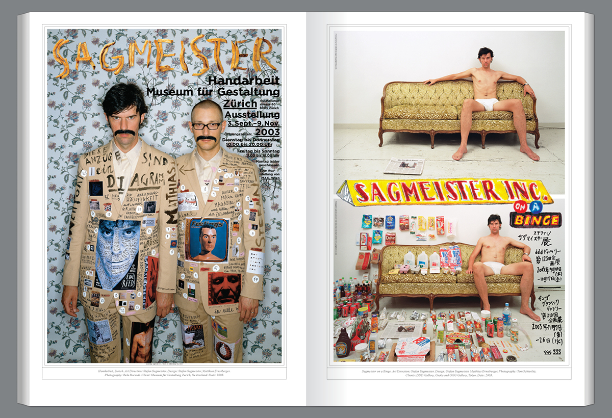
About 25 years ago, we started publishing maxims—things I had found in my diary—under the title “Things I’ve Learned in My Life So Far” in a wide variety of media, like on billboards, magazine spreads, and gallery walls. All these maxims came out of my life and sometimes took on complex typographic forms like letters made out of 6,500 ripe and unripe bananas at Deitch Projects in NYC. These maxims were also published as a book by Phaidon and seem to have had an unintended influence on the flood of typographic wisdom that designers started to flood Instagram with about a decade later.
In Now is Better, you tackle the topic of optimism. What compelled you to explore this theme, and how did creating the book impact your own outlook on the future?
I started to think about this subject when I was invited to be a designer in residence at the American Academy in Rome. I worked out of a gorgeous studio and had fantastic lunches and dinners with artists, writers, architects, and archeologists in the courtyard. These were quite salon-like meals with ever-changing pairings of tablemates. One evening, I wound up next to a very sharp lawyer who worked at the European court. We got to talk politics, and he told me that what we are now experiencing in Hungary, Poland, and Turkey, as well as in Brazil and the US, is really the end of democracy.
So, after dinner, I looked it up! When did modern democracy start? How did it do over the past two centuries? Where are we now?
Well, in 1823, only one democracy arguably existed: the United States. In 1923, 18 democratic countries had already been established following WWI. In 2024, we now have 96 democratic countries, and, for the first time in human history, more than half the world’s population lives in a democracy, so he COULD NOT HAVE BEEN MORE WRONG. Not only are we not seeing the end of democracy, we are living in the absolute golden age of democracy. This was interesting to me: a smart, highly educated person who clearly has no clue about the world he lives in.
Your exhibitions often engage the audience in unexpected ways, like encouraging them to write on walls or interact with installations. Why is participation so central to your work?
Well, the more I can make a viewer participate, the higher the chances of communicating something successfully.
What’s the biggest challenge in translating the conceptual depth of your books into exhibitions—or vice versa?
You can put much more information into a book than an exhibit, so funneling this down to the essentials is essential. And, of course, we can do things in a book that we can’t do in an exhibit and vice versa.
Are there any themes or ideas you’ve yet to explore in a book or exhibition but feel drawn to in the future?
I would hope so. I won’t be taking on any commercial client projects in the foreseeable future. It is possible that I might feel differently some years from now—I always have incredible difficulties predicting what might get me excited in the future. Still, for now, I will continue to look into myself and see what resonates. As I have been working as a designer for 40 years, I am extremely happy to indulge in this luxury.
You’ve discussed the importance of taking sabbaticals throughout your career. How do those breaks reshape your creative process?
At the beginning of my first sabbatical, I discovered fairly quickly that my initial desire to conduct this year without a plan (“a vacuum of time”) was ill-fated, and I came up with a very tight hourly plan. I looked through my diary and wrote down all the instances where I had complained about how busy I was and that I would really like to do “X” if I were not so busy. I added to this list, ordered them by importance into three, two, and one hourly segments, and wound up with a schedule, just like in grade school.
What advice would you give to others about the value of stepping away from their work?
I am not in a position to determine what other people should do, but I can say this: I have now talked to dozens and dozens of people who took a sabbatical, rich and poor, singles and families. EVERY single person thought it was among the best things they had ever done in their lives.
Stefan Sagmeister has designed for clients as diverse as the Rolling Stones, HBO, and the Guggenheim Museum. He’s a two-time Grammy winner and has also earned practically every important international design award. Stefan talks about the large subjects of our lives, like happiness or beauty, how they connect to design, and what that means to our everyday lives. He spoke five times at the official TED, making him among the three most frequently invited TED speakers. His books sell in the hundreds of thousands, and his exhibitions have been mounted in museums worldwide. His exhibit, “The Happy Show,” attracted over half a million visitors worldwide and became the most visited graphic design show in history. A native of Austria, he received his MFA from the University of Applied Arts Vienna and, as a Fulbright scholar, a master’s degree from Pratt Institute in New York.
Social: Instagram, Facebook, LinkedIn
Discover other creatives in the Graphis Journal #384.
You may also like
Fussil Vases, a Generative Dialogue Between Nature and Design
Rooted in research and material experimentation, Graphis New Talent 2025 Gold winner, Strahinja Jovanović challenges the idea…
Read MoreA View from the Side and the Power of Concept Driven Poster Design
Nemanja Dragojlović uses poster design as a precise, concept driven medium to surface perspectives that often remain…
Read More
Related Annuals & Publications
View All


Become a Graphis Member
- 1-Year Membership Subscription
- Enjoy 50% off on Call for Entries
- Your Portfolio online with profile + links
- Get 20% off on Graphis Books