Simon Johnston on Making Designers Think Bigger
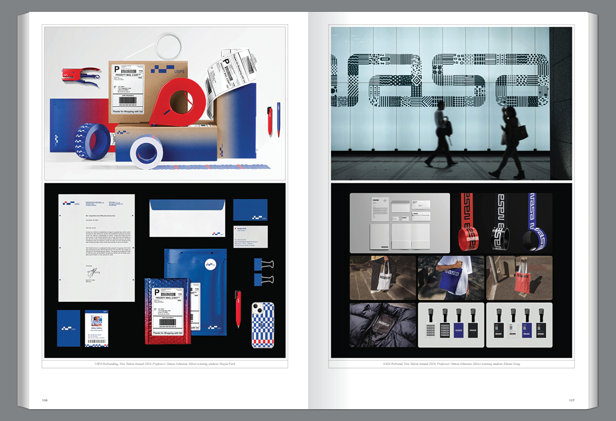
Simon Johnston’s impact in design extends beyond his acclaimed professional achievements as a designer and co-founder of 8vo studio and Octavo journal. Through his role as a professor at the ArtCenter College of Design and creative director of the Hoffmitz Milken Center for Typography, Simon has cultivated a legacy of inspiring and shaping the next generation of designers. His teaching philosophy integrates technical precision with conceptual exploration, underscoring the significance of typography as both a craft and an art form. In this insightful Q&A, Simon reflects on his approach to education, the evolution of graphic design, and the enduring importance of a rigorous foundation in creative practice.
Introduction by Lavinia Lascaris, Designer, Professor, & Associate Director, Hoffmitz Milken Center for Typography
Of the countless lessons Simon Johnston imparts in his classroom, two are my favorite: first, to think of type as music and to treat the negative space in typography as the space between the notes in a musical composition, and second, to recognize that typography shapes how we see and understand words, and so essential to mastering it is a deep love and respect for language. I am sure that each of the thousands of students he has taught has their own set of favorites among the many memorable metaphors and visual analogies he brings to his lessons. Simon has shaped a generation of graphic designers. In his 30+ years of teaching, he has developed a comprehensive curriculum for typography that combines technical skills with conceptual depth. His ability to inspire critical thinking and distill the essence of form defines his pedagogy and leaves an indelible mark on those who learn from him.
What is your process for selecting a student for your class? Are there specific qualifications?
I don’t select the students. They apply for one of my classes through the college’s time-sensitive online application system. We have a progressive, cumulative curriculum which, as a faculty director, I have been involved in developing, so students applying for a Typography 3 class, for example, will have been required to take Type 1 and 2, or those applying for my Communication Design 4: Identity Systems class will have had to take the previous three classes in the CD sequence. Each class in the Type and CD sequences has its own required learning outcomes and builds on the previous one, with some overlap for reinforcement. Each is intended to progressively encourage and develop the student’s conceptual and formal skills, hence the prerequisite classes.
What might be a typical first assignment?
Typically, I teach three classes: CD4: Identity Systems, Type 3, and then either Information Design or a Grad Type 3 class. CD4 is a term-long assignment where I give the students a choice between a cultural, commercial, or event-based identity. Research is always the first phase in any assignment. I don’t want the students to start designing immediately; instead, I want them to become immersed in their research to get a deeper sense of the subject matter. That way, their design ideas will come from a place of knowledge. I refer to this as organic design because it is rooted in and grows from an understanding of the content. In Type 3, we usually begin with designing a text-heavy, eight-page plus cover booklet for a writer; the intention behind this is to enable the students to lose any fear they might have of dealing with grids and quantities of text, to refine their typeface choices, and to find an appropriate typographic voice for the content and context. A short initial information design project is typically black-and-white only and is based on an analysis of a narrow subject field, such as screen aspect ratios. The pedagogical thinking behind an assignment is very important. For instance, I would never set an assignment such as an identity for an Italian or Mexican restaurant, as the students typically would mimic pre-existing aesthetics, and it just becomes an exercise in producing a pastiche of what is already out there rather than an opportunity for innovation and experimentation. Some types of assignments are conducive to learning, but others are not.
Do you ever ask them to include something they’re passionate about in their work for your class?
This can work for some graduate classes or upper-term students when they’ve acquired good formal skills, but for the most part, early-term projects need to be rigorously structured to develop thinking and formal skills. I find predetermined assignments to be most effective at that early phase, as they have particular required learning outcomes. But of course, you have to find ways in the classroom to engage the students and make them passionate about design and typography.
Do you work with students individually or in groups?
Initially, all critiques are group critiques with the work up on the wall so that the students can see one another’s work developing on a week-to-week basis. They can learn as much from seeing their classmates’ work develop as they can from listening to me. Group crits are the best way to expose students to different ways of analyzing and discussing their work. Students are encouraged to provide feedback, ask questions of their fellow students, and develop their critical faculties along with my guidance. In the latter half of the term, I will switch to a mixture of group and individual critiques in a more working studio environment. In CD4: Identity Systems, for example, this means that students will already have the main identity resolved by week seven, and the second half of the term is about making refinements to a range of graphic applications using their new identity. Individual crits are better suited to refinements of details later in the term.
How do you develop and raise your student’s visual and verbal standards?
Regarding verbal standards, I talk to the students about the importance of what I refer to as “verbalizing the visual” and that they need to develop their skills in articulating visual concepts and approaches. They need to have a strong visual vocabulary and an analytical approach to discussing design matters that go beyond the language of someone who is not visually trained. A recently graduated student showed me a note she took in one of my classes where I banned the students from saying, “Just tweak it to make it pop.” This is something a client might say, but designers need to learn to be more articulate than that. The better the students intelligently explain their concepts and design moves, the easier it is for a client or colleague to agree with the design direction. I also point out that the operational reality of the design is that it ultimately has to communicate on its own and be self-explanatory without anyone there to talk about it.
Regarding visual standards, I emphasize the importance of developing formal skills at every level. You can have the best concept in the world, but without good formal skills to express it, the idea will fall flat on its face. Students should be able to analyze and deconstruct a design in terms of concept, language, scale relationships, color, tonal values, hierarchies, alignments, eye movement, typographic voice, and so forth, rather like a mechanic can deconstruct an engine and put it back together after fixing a problem. I tell students that the design process takes several steps and that you cannot see the end result from the starting point. The final design is around the corner, and it might take 16 steps to get around that corner before you can see the final design direction. You must put in the time and create multiple iterations and variations before the final design reveals itself.
What percentage of a typical class goes on to create award-winning work?
Awards are not a focus at all in the process of teaching. Of course, they’re a nice bonus after the work is done, but if you start a project thinking about awards, you’ll take your eye off the ball and not have a good working process. Get the research, the initial concepts, the design development, and the refinement process right, and the results will follow.
What advice do you give the class at the end of the semester?
Often, I will recap the main points from the class that I want them to take away. I remind them that we are making visual equations and that the work will only be as strong as the weakest point in the equation, so analyze where that might be and improve it. I remind them that designing takes time and involves producing and refining many options. At the start of the project, there are 360 degrees of possible directions. Don’t narrow it down too soon and just fall in love with your first idea. What is the opposite of your first idea? Give yourself reference points to navigate towards the most promising direction. Don’t be afraid of simplicity or evident structure. Don’t be scared to be brave and change something at the last minute if it comes from a late realization of what is needed. Order and structure are perceived as intelligence by a viewer. Ask yourself what intelligence can look like in a design. We don’t talk about that enough. I want them to be greedy in the sense that I want to see intelligence AND beauty in their designs. For typography students, I tell them that learning typography is like learning a language—you can start with no knowledge of it but slowly learn to become fluent, by which I mean having control over it and making it say what you want it to say in an effective and appropriate tone of voice. I tell them to have the mindset to make their next piece of work the best thing they have ever done and to keep that intention going throughout their career.
Can you name a few of your past students who have found success? If so, what are they doing now?
I am blessed to have taught so many great students over the years, some of whom I have also been able to mentor as teachers. In no particular order: Mike Abbink is executive creative director at IBM and designed the IBM Plex typeface; River Jukes-Hudson and Stephen Serrato run the design studio Ella in Los Angeles, and both now teach at ArtCenter; Elizabeth Azen Andia runs EA Projects in Brooklyn; Ben Schwartz collaborates with Laurenz Brunner and others and just published Unlicensed: Bootlegging as Creative Practice; Lavinia Lascaris is a director at the Hoffmitz Milken Center for Typography (HMCT) at ArtCenter and also teaches there; Ximena Amaya is a designer at HMCT; Tim Bavington is an artist based in Las Vegas; Josh Finklea is a typeface designer; Jorge Verdin was a graphic and sound designer (RIP); Thomas Mueller is global head of design at Accenture Song; Hank H. Huang; Austin Redman; Josh Moore; Pat Slack; and too many past students to name individually who work at Apple and Google. I am having flashbacks. There are too many to mention.
What attracted you to teaching at your current school?
I had moved from London to California to be with my girlfriend. The day after I landed, I was invited to teach at ArtCenter by Ramone Muñoz, a revered professor who knew of Octavo, the typographic journal I’d started in London with my 8vo studio colleagues in 1986. The college has a pragmatic edge to it, successfully educating students for employment in the creative industries by blending conceptual and formal rigor with experimentation and a sense of adventure. We are lucky to have highly motivated students who are prepared to put in the time and effort and are open to learning.
What do you think of how so many creative people are now without formal, never mind university-level, training?
The nature of graphic design practice is that it is a commissioned, socially engaged partnership where the designer has responsibilities to both the client and the viewer. As designers, we are in the middle of this tripartite relationship—we take raw, unformed communication materials and give them form appropriate to both the client and the end user. To do this well takes extensive training. Of course, some will get into creative fields based on their ability in one area, but they will likely have a narrow focus. Some may take internships and learn on the job, but nothing can replace a degree-level education in your chosen field. Even if you think of yourself as a creative rebel who wants to break the rules and make anti-structure, you will do a better job if you first learn about structure. A well-rounded design education is imperative if you want to keep growing and have a promising career. Its importance cannot be underestimated. Once, in a faculty meeting, a colleague used the phrase, “But in the real world…” I realize it is a commonly used cliché. Still, I felt obliged to point out to him that what he was referring to was the commercial world and that to use that phrase is to imply that education is somehow not part of the real world. The phrase downplays the importance of the very real world of education.
Can you tell us something about your background?
I studied in England at the Bath Academy of Art and then in Basel, Switzerland, where I studied with Armin Hofmann and Wolfgang Weingart. Then I returned to London, where I co-founded 8vo studio and Octavo, which was recently reprinted in the book Octavo Redux by Unit Editions. I have now been in California for over 30 years, dividing my time between teaching, my design studio (mainly designing books for galleries and museums), and my art and photography practice.
Teaching is giving. It is a sacred responsibility to effectively impart your knowledge and experience regarding the art of visual communication and then pass the torch to inspire the next generation. As I reach the end of my teaching journey, I remember that once, when I came home exhausted from teaching, my wife reminded me of a quote from the artist Joseph Beuys: “To be a teacher is my greatest work of art.”
Simon Johnston is a designer, artist, photographer, and educator. Born in England, he was educated at the Bath Academy of Art and the Kunstgewerbeschule in Basel, Switzerland. In 1984, he co-founded the London design studio 8vo and was the instigator and co-editor of the typography journal Octavo. Simon Johnston Design, his current design practice in Los Angeles, focuses on publications for artists, art galleries, and museums. He is a professor at the ArtCenter College of Design in Pasadena and creative director of the Hoffmitz Milken Center for Typography. He divides his time between book design, education, and his own art and photography practice.
Discover other talents in Graphis Journal 383.
You may also like
Antonio Castro H and the Beauty of Overlooked Species
Awarded Gold in the Graphis Poster Awards 2026, One World / One Chihuahuan Desert is a poster…
Read MoreVisualizing Climate Impact in Unexpected Hues
Gold in the Poster Awards 2026, Franziska Stetter’s Unexpected Hues – Human Impact on Ocean Colors turns…
Read More
Related Annuals & Publications
View AllBecome a Graphis Member
- 1-Year Membership Subscription
- Enjoy 50% off on Call for Entries
- Your Portfolio online with profile + links
- Get 20% off on Graphis Books

