Rethinking Packaging as Product
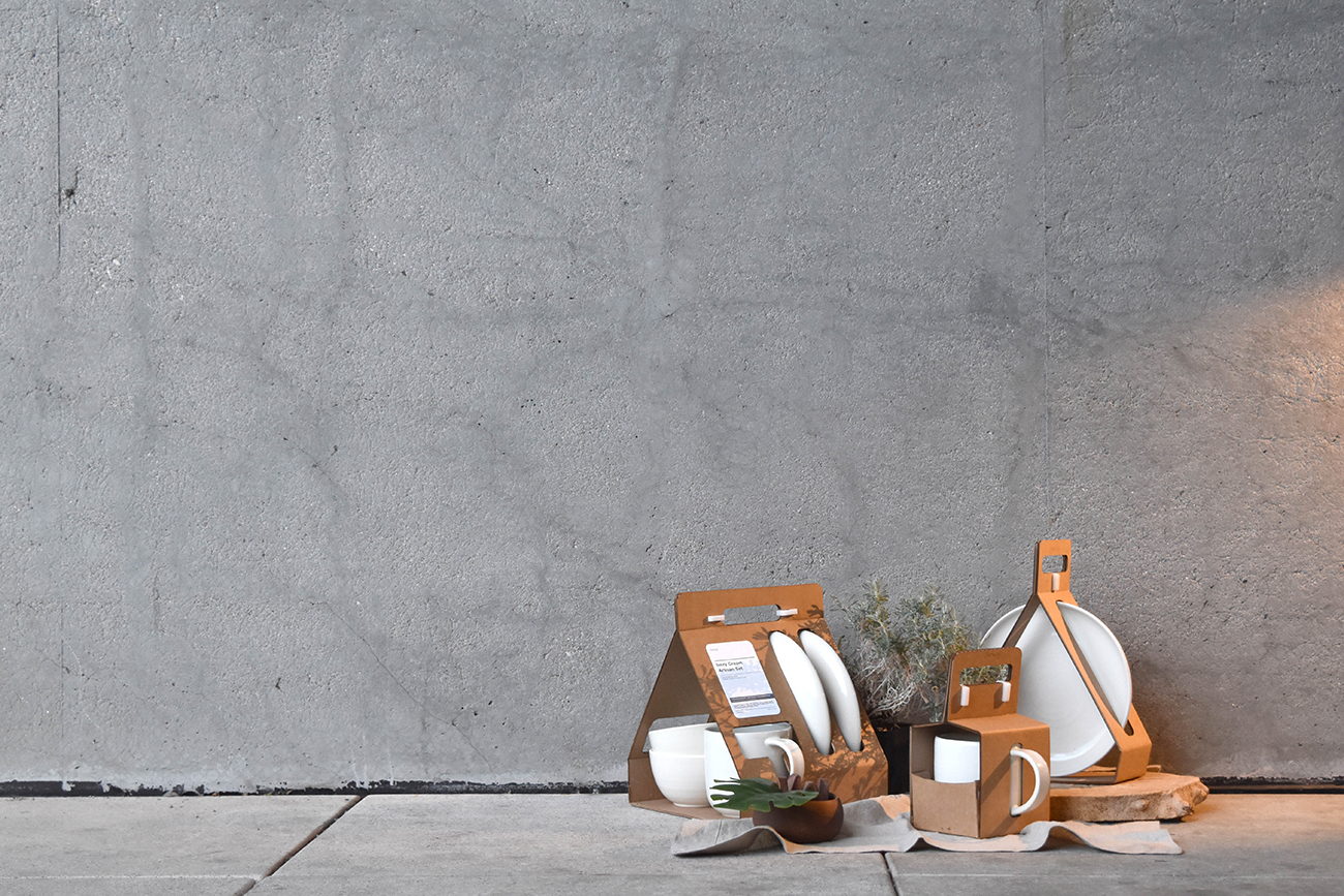
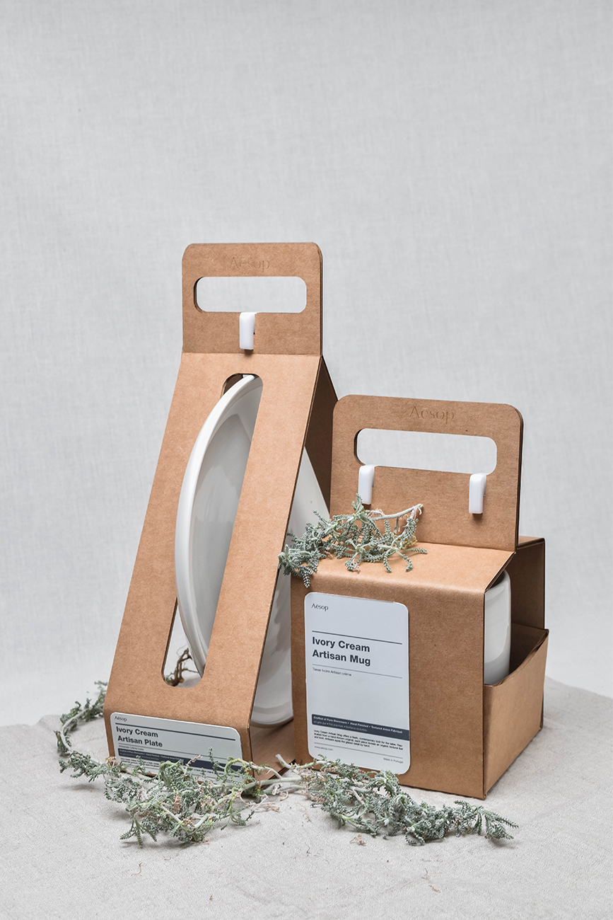
What happens when we stop treating packaging as something secondary and start seeing it as part of the product experience itself? Kenneth Kuh, the lead designer of Studio.KK, asked himself that question when working on the “Aesop Packaging Set,” a design project that conceptualized how the brand’s aesthetic might evolve if it launched a ceramics line. Working with often-overlooked materials—such as corrugated cardboard—and drawing inspiration from Japanese design books, material studies, and the concept of “re-design,” Kenneth asks us to reconsider the boundary between function and form in this case study that’s more than about the packaging holding an object; it’s about shaping perception, provoking curiosity, and honoring the material itself.
By: Kenneth Kuh, Designer, Studio.KK
What was your project about, and what did it aim to achieve?
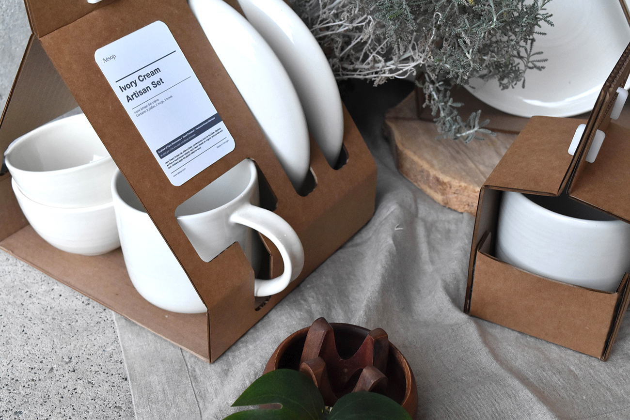
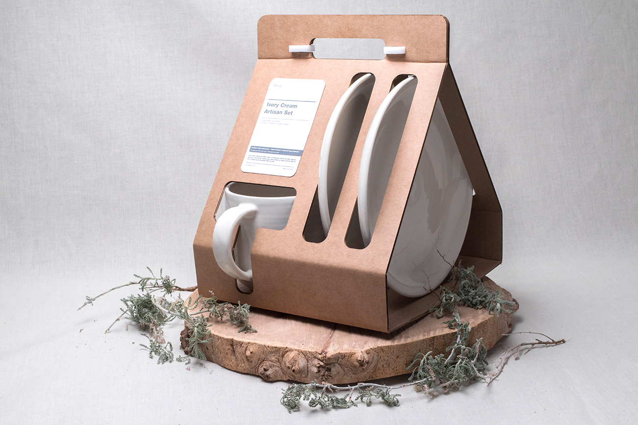
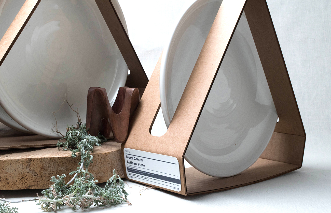
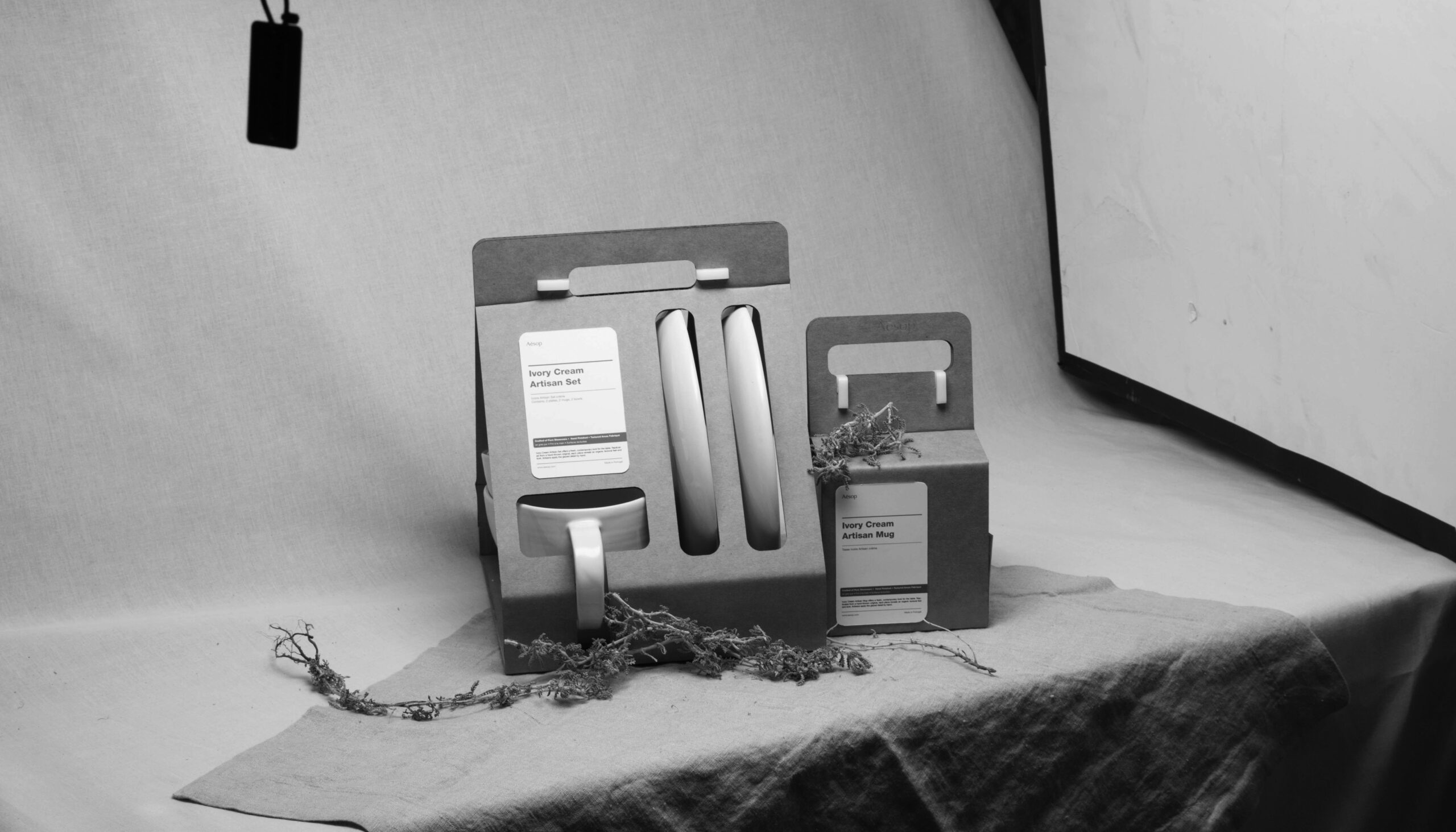
The Aesop Packaging Set is a conceptual design proposal imagining how the brand’s packaging might evolve if it expanded into a ceramics line. At its core, the project explores how an everyday material—corrugated cardboard—can be recontextualized, shifting from utilitarian protection to an object of design. Where do we draw the line between function and form? The work examines this threshold, inviting us to see packaging not just as a vessel but as part of the product experience itself.
What inspired you?
Before working on this packaging set, I was reading Designing Design by Kenya Hara and Materials and Body by Kurokawa Masazhi. Even though I’m not a packaging or product designer, I’ve always been drawn to how materials can create new haptic experiences. One concept that stood out to me was the idea of “re-design”—treating familiar objects as if for the first time to uncover unseen possibilities. So, what if we not only reimagined Aesop as a ceramics brand but also reimagined the role of cardboard? Not just a material to absorb compression but the packaging itself. Good packaging shouldn’t steal the spotlight from the object—it should complement it. Just like how you’re not supposed to remember what a fork looks like because the focus should be on the food. This project became a reflection on form language, material meaning, and how to create packaging that embodies both aesthetics and functionality.
What was your creative strategy and approach?
My approach was to treat this not strictly as a packaging design project but more as a form study. I explored how cardboard could take on new meaning through minimal intervention—almost like reframing rather than inventing. I kept returning to the idea that packaging should feel like an extension of the product, not a layer that separates it from the user. That became the core strategy: exploring contextual shifts through material and form.
What were the main challenges, and how did you overcome them?
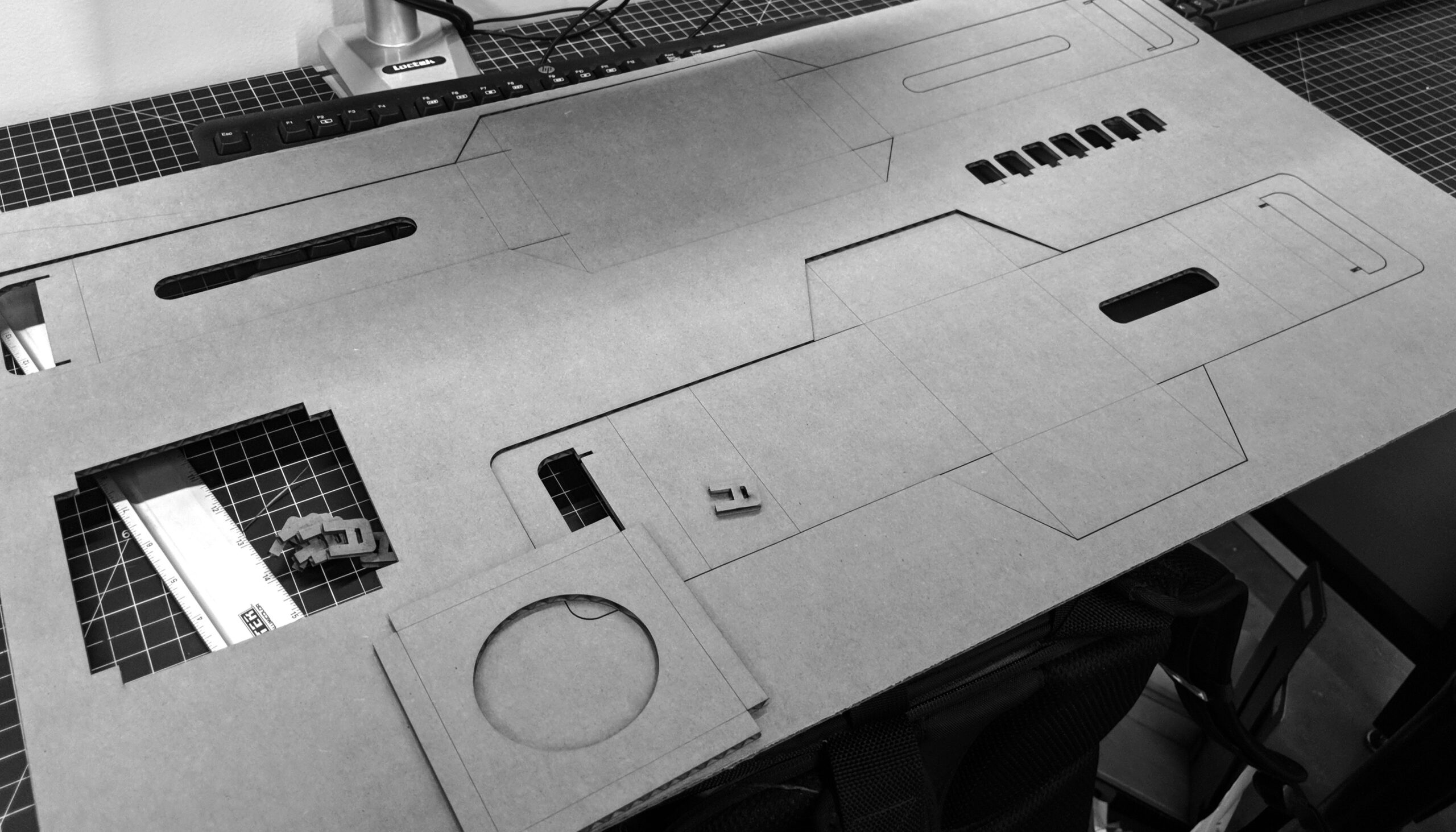
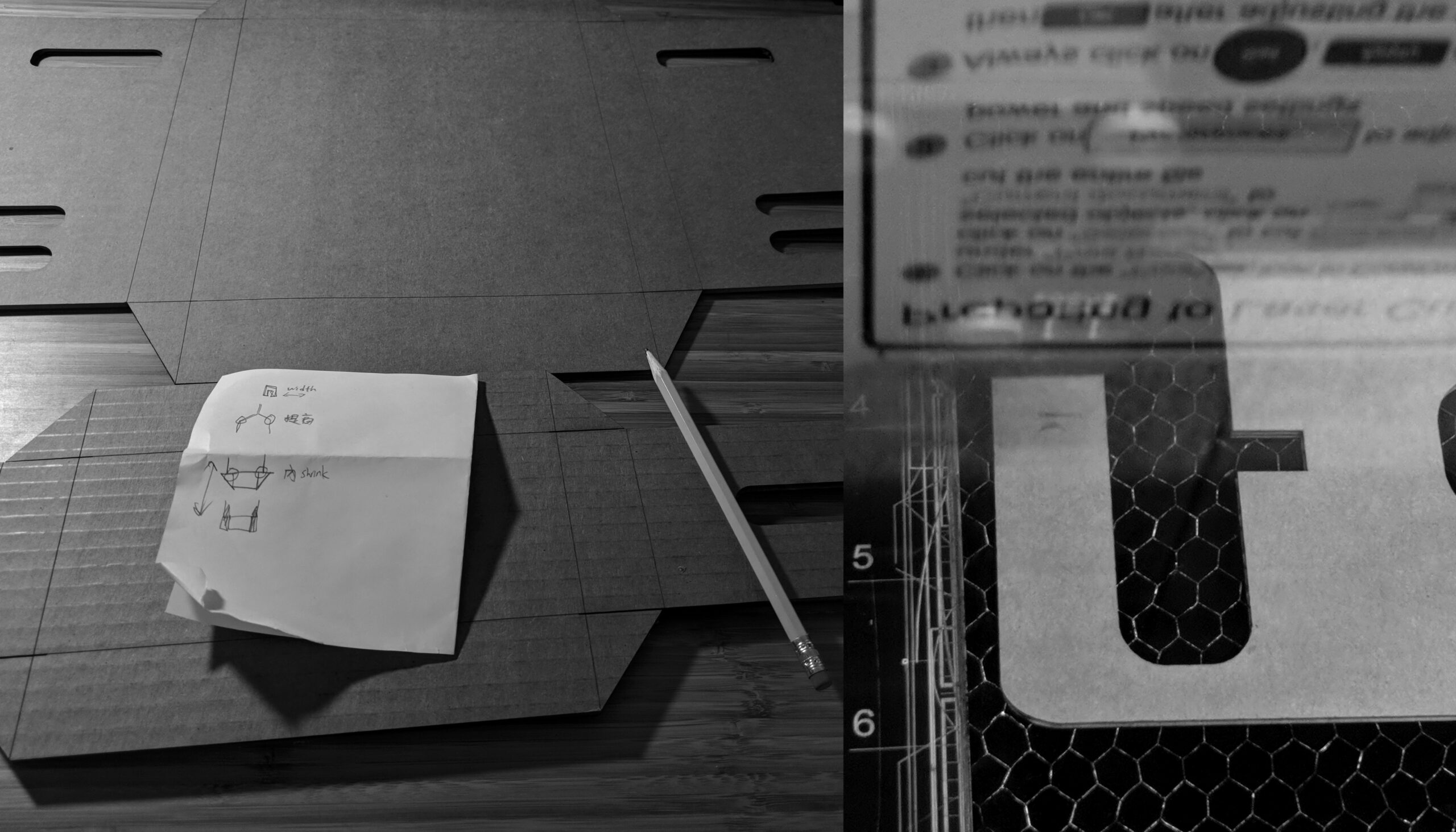
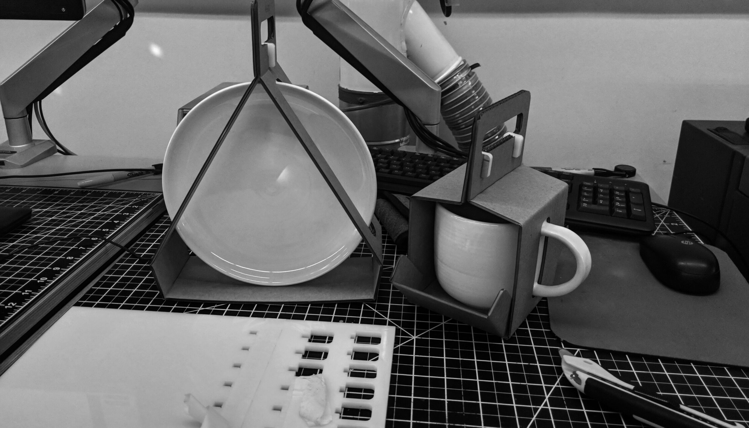
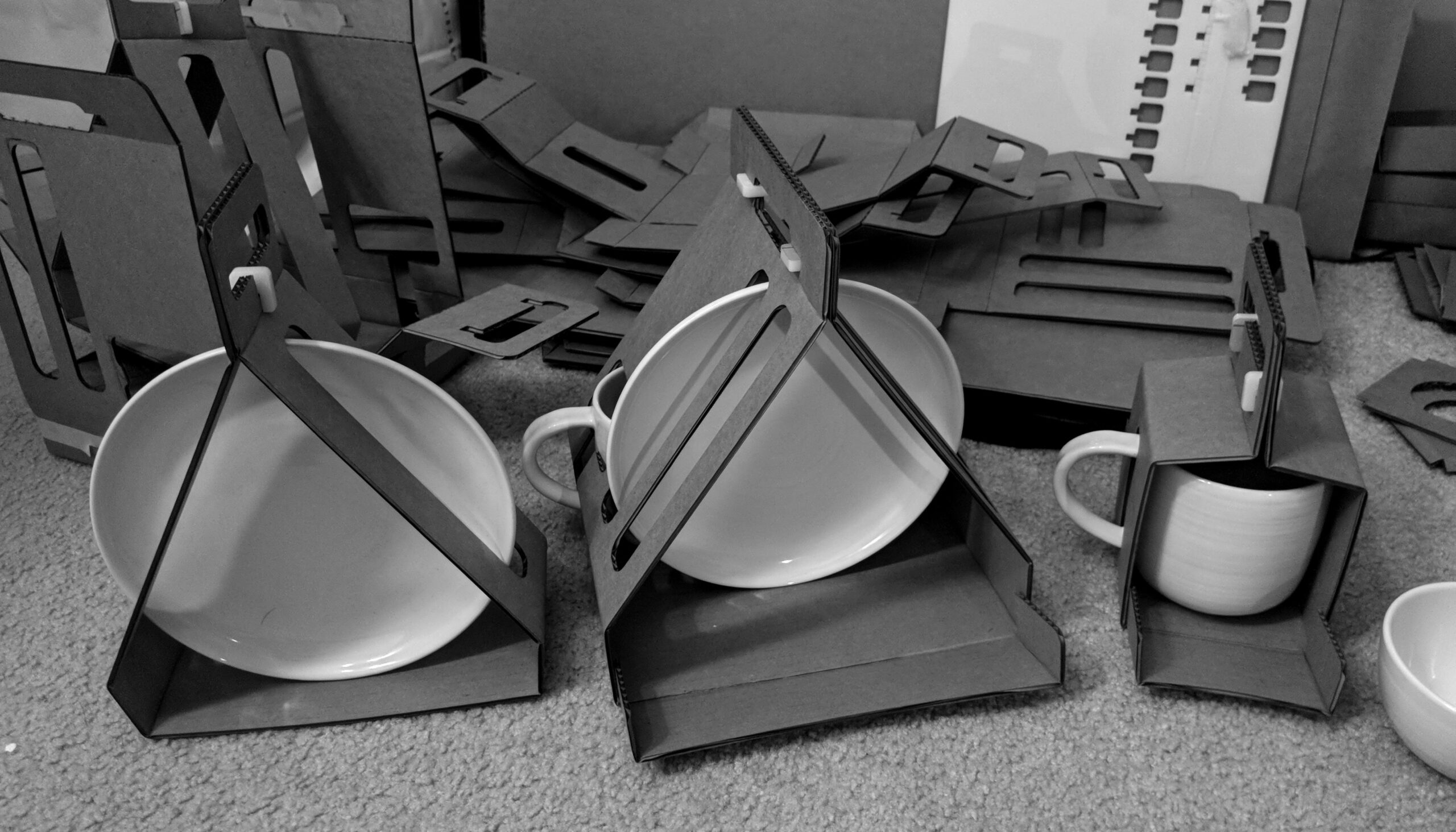
The biggest challenge was realizing how difficult cardboard actually is to work with. Structurally, it’s not ideal for holding weight without reinforcement—especially when dealing with heavy ceramic plates. I went through many iterations, eventually designing a deeper handle structure to support the load and slightly widening the sides to better distribute the weight. The second issue was the sheer variety of cardboard types: corrugated, paperboard, honeycomb, and more. After testing several, I chose a double-walled corrugated board for its strength and availability. Lastly, precision in crafting was tricky—corrugated cardboard can crush or deform easily at the folds, so I used a laser cutter to ensure clean, crisp edges.
Discuss any innovative techniques or tools used to achieve the final result.
Using the laser cutter was key. Corrugated cardboard deforms easily, so clean cuts were only possible with precise tooling. Even then, it took a lot of trial and error to find the right settings—too fast and it wouldn’t cut through; too slow and it would burn the material. It was all about fine-tuning the power and speed to strike the right balance.
What brings you the most satisfaction about this project?
What brings the most satisfaction is that I approached this entirely from a “visual designer’s” perspective and still created something that resonated with others. I didn’t follow traditional packaging rules—I treated it as a design experiment in form and context. Throughout the process, I felt imposter syndrome because I had no formal background in packaging and was figuring everything out through research, trial and error, and instinct. But the fact that people found the work compelling—and that it sparked curiosity and dialogue—reminded me that meaningful design doesn’t have to stay in one lane; it can thrive in the overlaps.
What was the outcome of the project? What makes you proudest about the final result?
This project wasn’t just about packaging—it was a way for me to explore form, structure, and perception. It made me question: at what point does cardboard stop being “just cardboard” and start becoming packaging? Where is the threshold where perception shifts? I’m proud of the insights I gained through iteration and the experience of pushing myself into unfamiliar territory. These are valuable lessons I can carry into future projects.
How did this work influence your creative perspective? How did this project push your creative boundaries?
This project gave me the confidence to explore design beyond my core practice of branding and motion. It showed me how transferable design thinking can be—how architectural principles, for instance, can shift the way I understand grid systems in typography. Design isn’t flat; it’s dimensional. At the same time, working with a medium I had no formal experience in—packaging—pushed me to trust my instincts and lean on what I’d absorbed through reading, research, and iteration. It expanded the way I think about structure, material, and form and reminded me that I don’t need to wait until I feel “qualified” to explore something new. Creating from curiosity is enough.
How did this project reflect or evolve your creative voice?
It helped me sharpen my voice by focusing on intentionality. How do we distill a concept until everything in it has a purpose? It taught me to embrace modularity, to think in systems that scale, and to respect material honesty, just like how I didn’t try to disguise cardboard but let it be what it is. That same thinking now shapes how I treat typography, layout, and visual form: let the type be type, design with intention, and approach decoration with clarity and purpose.
Kenneth Kuh is a creative based in San Francisco, drawn to the idea that we—like the designs we make—are vessels of experience. Born in Los Angeles and raised between Taipei and Shanghai, his work reflects a life lived between cultures, constantly mapping meaning across identities, mediums, and form. His practice spans brand, motion, editorial, and packaging, but the throughline remains the same: form as message. Just as objects carry stories, so do we. For Kenneth, design is a way of shaping that vessel of self, memory, and intent. He’s still shaping his one project at a time.
Social: Instagram, LinkedIn, X (Twitter)
Want to see more packaging design? Check out our Design 2025 and Packaging 10 winners on our website!
You may also like
Pop Goes the Beer Can
When Collective Arts Brewing handed over their can as a blank canvas, it wasn’t just an invitation…
Read MoreHow a Sriracha Shortage Sparked a Love Story
What happens when a beloved hot sauce disappears from shelves? For most brands, it’s just a blip….
Read More
Related Annuals & Publications
View All


Become a Graphis Member
- 1-Year Membership Subscription
- Enjoy 50% off on Call for Entries
- 1-Year FREE Subscription to Graphis Journal
- Your Portfolio online with profile + links
- Get 20% off on Graphis Books