From Concept to Cover, Crafting Visual Stories for Historical Fiction
Behind every compelling book cover lies a story of creative collaboration and artistic vision. At Greenleaf Book Group, two award-winning designers recently brought to life the essence of historical fiction through their distinctive cover designs. Kim Lance’s “The Catbird Seat” masterfully weaves Civil War-era diary elements with Southern symbolism, while Neil Gonzalez’s “All I See is Violence” captures the raw intensity of Native American conflict through bold imagery and typography.
By: Kim Lance, Lead Designer, & Neil Gonzalez, Art Director
The Catbird Seat
Working on the design for The Catbird Seat by Rebecca Hollingsworth was one of the more demanding and rewarding periods of my career as a book cover designer. The author and I were actively creating and revising the artwork for eight to ten weeks, which is a long time in the world of contemporary publication design. We continued to fine-tune the custom endsheets and interior design long after the cover artwork was finished. It was a labor of love for the author, who also happened to be a former graphic designer and was eager to collaborate on her book’s design.
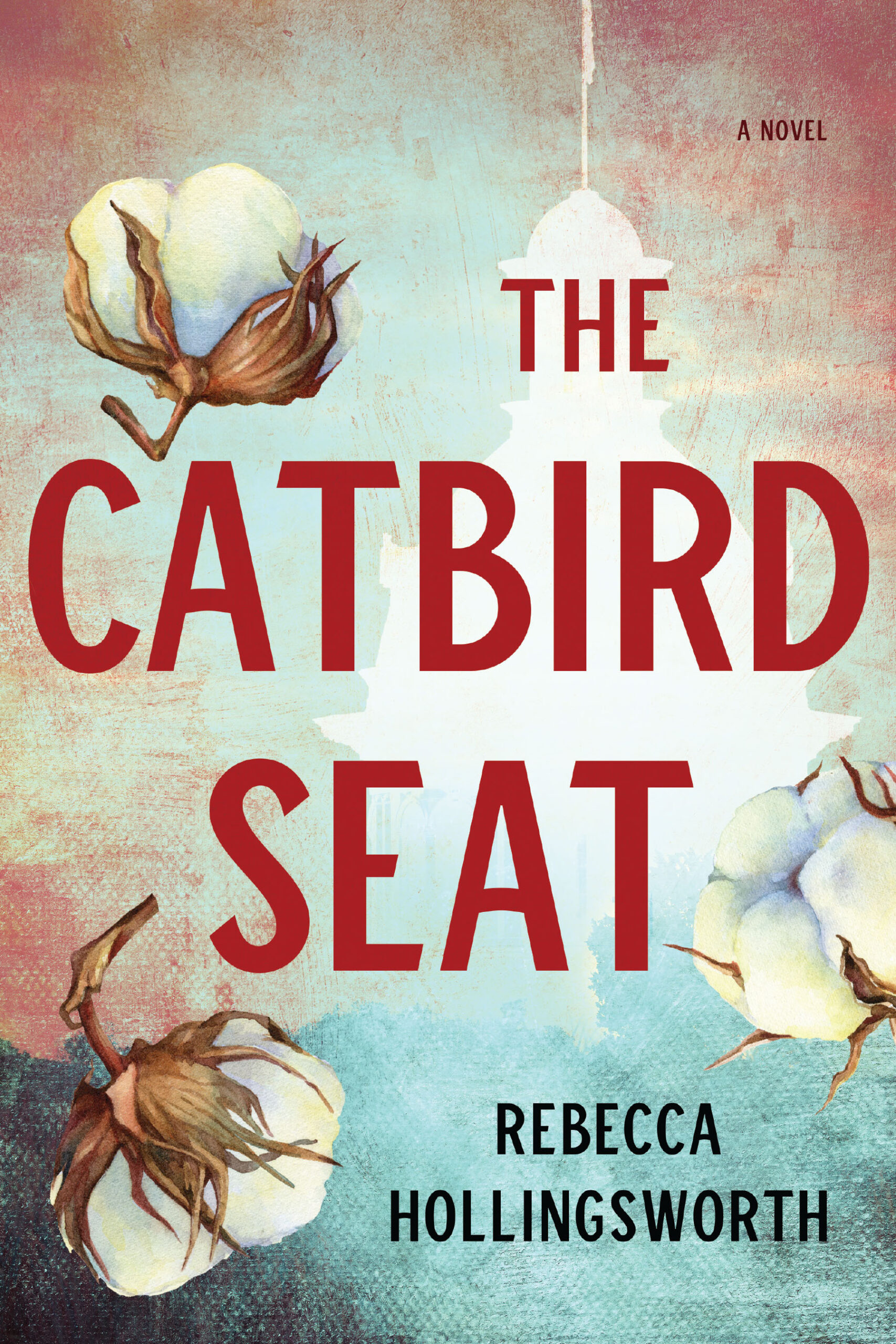
The book is a very interesting combination of the New South and Old South; it weaves together a story set in modern-day Charleston, South Carolina, and a fictional historical account of a slave and slave owner in 1857. The narrative uses diary entries to tell their story, so a diary was a possible visual element that could be part of the cover design.
When I set out to design a fiction book cover, I first gather materials from the editorial team: the working manuscript, any notes available from titling discussions, and the project editor’s take on the material. Before reaching out to the author to begin our dialogue, I like to have a good head start on reading the book to understand the author’s voice and the content. Rebecca was ready to go with her input for the design, which is not always the case. Some authors provide very little input, usually because they are not comfortable with design. I am always adaptable to whatever style of input works best for the author.
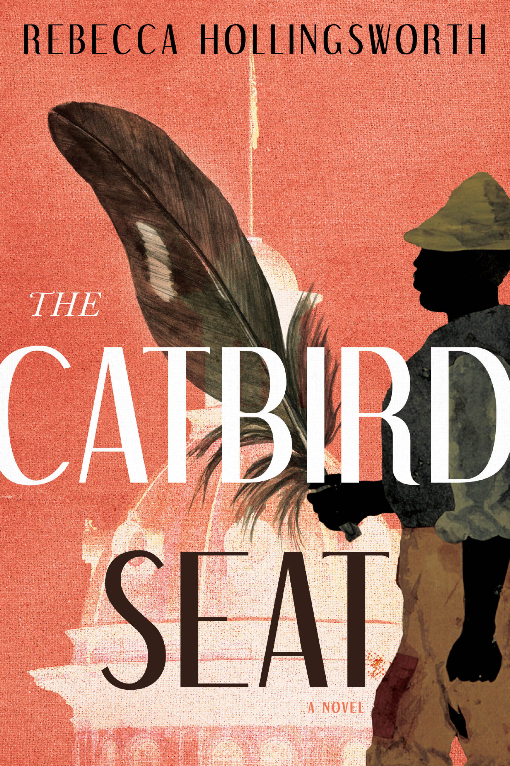
For The Catbird Seat, it was important that the cover design have a sense of place (the South), and I really wanted the artwork to take advantage of the title’s clever reference. According to Wikipedia, “a catbird seat” is an idiomatic phrase used to describe an enviable position or the upper hand, and it derives from the secluded perch on which the gray catbird makes its mocking calls. So, three out of the four cover designs that I first sent Rebecca included a visual reference to the gray catbird.
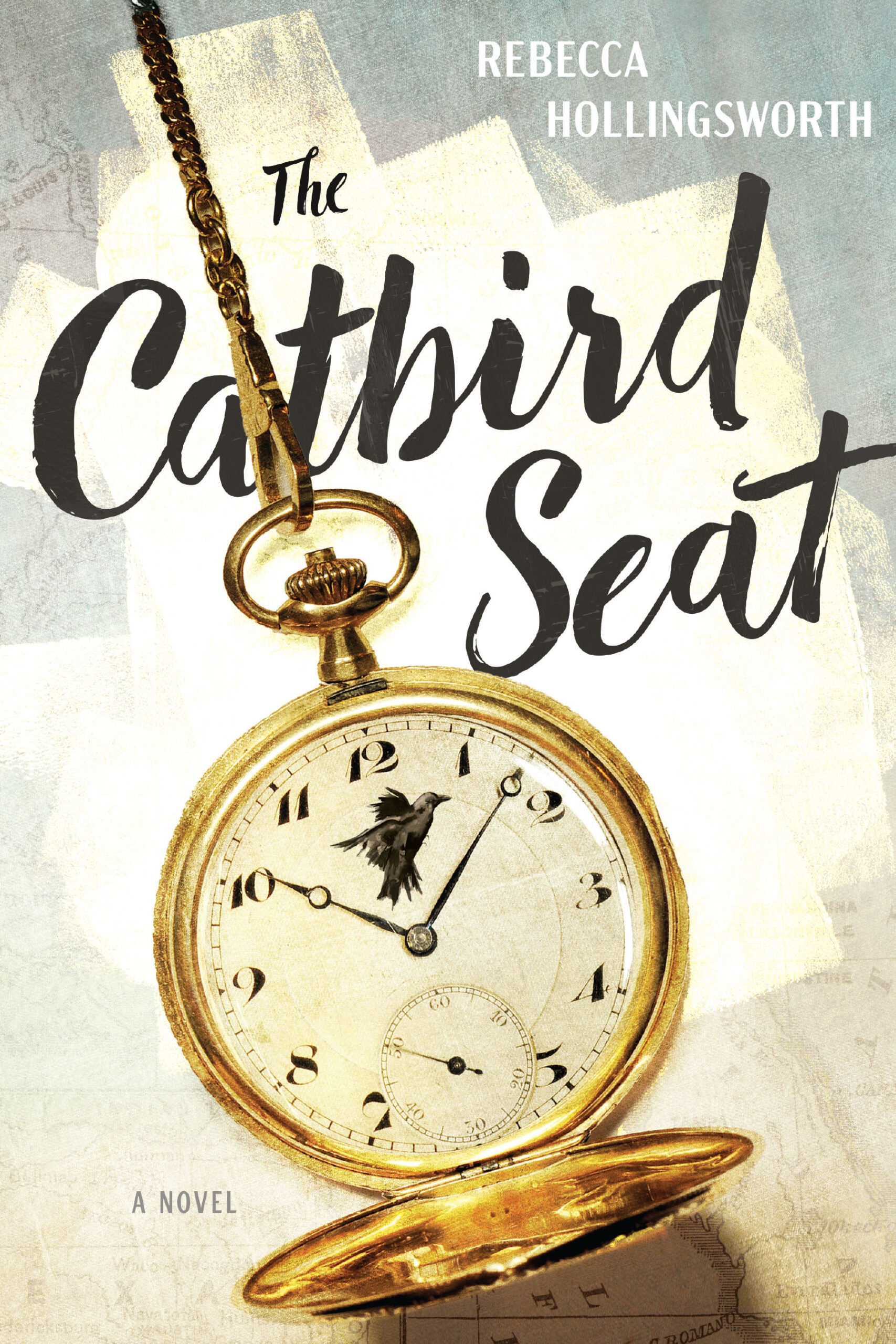
The very first design in the original PDF file of possible cover comps (comprehensive layouts) is strikingly similar to the final cover artwork. I had an “Ah-ha!” moment, as I like to think of them, of incorporating the catbird seat reference as part of the diary artwork: a sort of book cover within a book cover simulation. The author was drawn to this cover right away, and we focused our energy on creating a Civil War-style diary that was an accurate reflection of the time period. This cover was designed before the new generative AI tools had been introduced to Adobe Photoshop, so it was a painstaking process of combining multiple stock images to create possible diary designs until we landed on the perfect blend. As they say, the devil is in the details.
I love how the end result is still conceptually beautiful rather than just overly literal; the author understood that the imagery had to be not only somewhat historically accurate but also compelling. That is always the most important question I ask when working: “Is this design compelling?” I hope, as designers, we can keep making compelling, human-based work even as our software tools continue to get more complex.
All I See is Violence
“A human skull wearing an Indian chief headdress” was all the author told me when I asked what she would like to see on her book cover. I got excited because of two things:
(1) Having a client who knows exactly what they want takes a lot of the guesswork out of the equation and lets me skip some of the brainstorming process and get right to designing
(2) A skull in an Indian headdress is a cool image to have on a cover, and I knew I could do something really awesome with it.
Working at Greenleaf Book Group is great because we’re a hybrid publisher where we work closely with our authors. For All I See Is Violence, I started by searching stock image websites, including Adobe Stock. There were a lot of skulls with a headdress already created, but I knew a better approach would be to create my own image by combining two separate images myself. That way, it’s a more unique image, and I have more control over what it will look like. I use stock images a lot, but I always recommend combining or altering the images in a way that it’s not so stock. Anyone can use the exact same image as you, so I always try to customize it somehow.
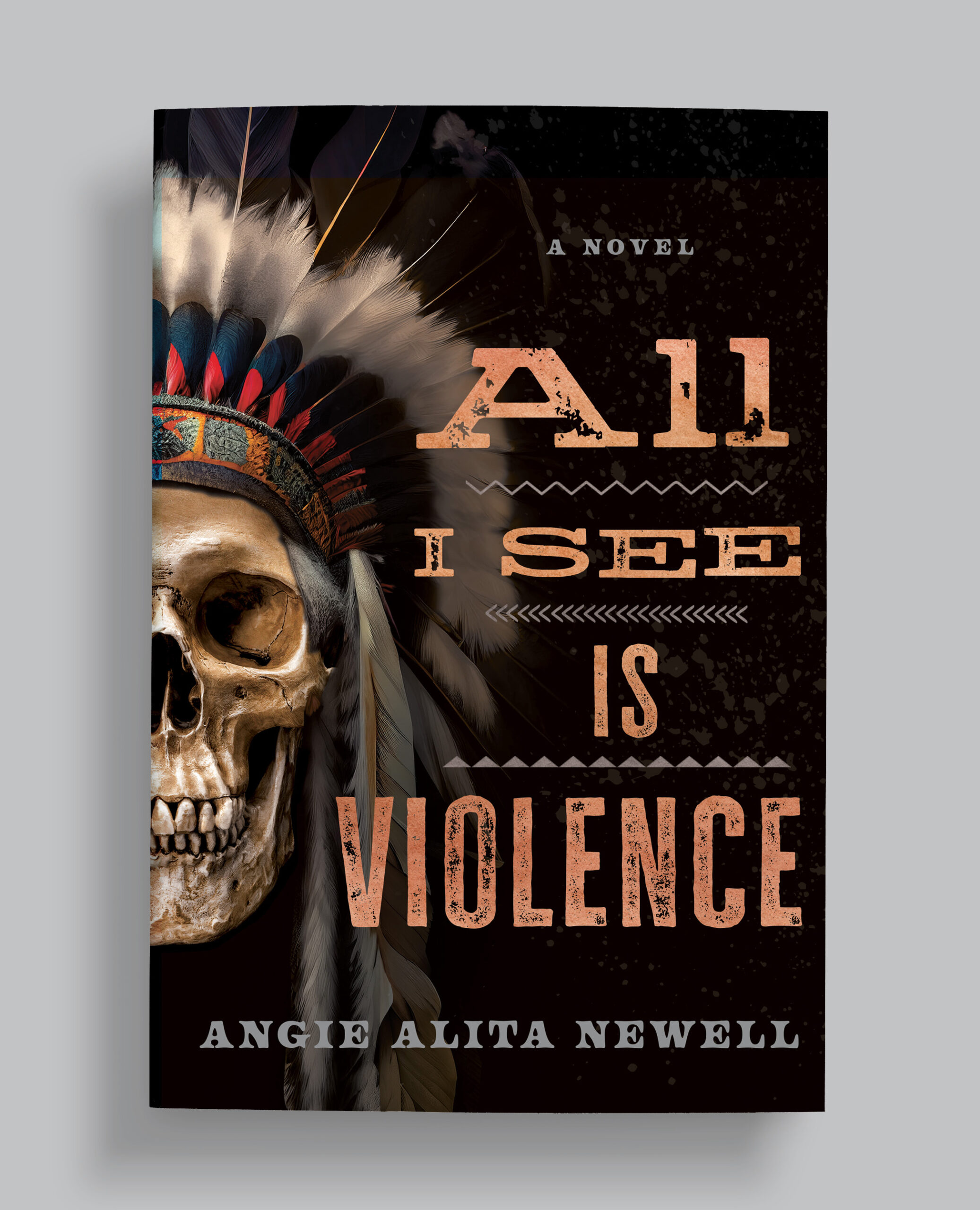
I found several cool stock photos that would work, including some options with a straight-ahead shot of the skull and some options with a side profile view. That’s when I had the idea to run the title down along the curvature of the headdress. I love it when you come across a cool image while doing image research, and it sparks a new idea or concept that you can add to your initial list of ideas to try.
Once I composited the main image together and placed it on the cover, I needed to figure out a font for the title. I immediately thought a handwritten font would give the cover a raw, gritty, handmade appearance that would match the tone of the book perfectly. A modern Sans serif wouldn’t be fitting for a story set in the 1800s, and a regular Serif display font wouldn’t have the look I was after. I found a hand-drawn font called Aderly Pro Blockletter that was a perfect option to use as a base. I rasterized and warped each letter individually and staggered them off the baseline to make the title less rigid and more organic. I then used a mask to remove some parts of the letters to make them feel worn and also used a textured brush to paint over the letters and add an extra layer of messiness. That made it feel more hand-drawn and not simply a typed-out font. I find any time you can do something hand-drawn, it adds an extra “specialness” that automatically elevates the design. Of course, not all projects are a good fit for a handmade approach—for example, I wouldn’t necessarily do it on a business book. But when you can do it, it’s definitely worth exploring as an option.
For the other text on the cover, I used a traditional Clarendon font. Since this book is about the battle between Native Americans and the US Army during the American Civil War, I thought using a font like Clarendon gave it a Western look, which felt appropriate. I think Clarendon is a little overused as a Western font, but in this case, it worked well since it was a secondary font, not the main title font.
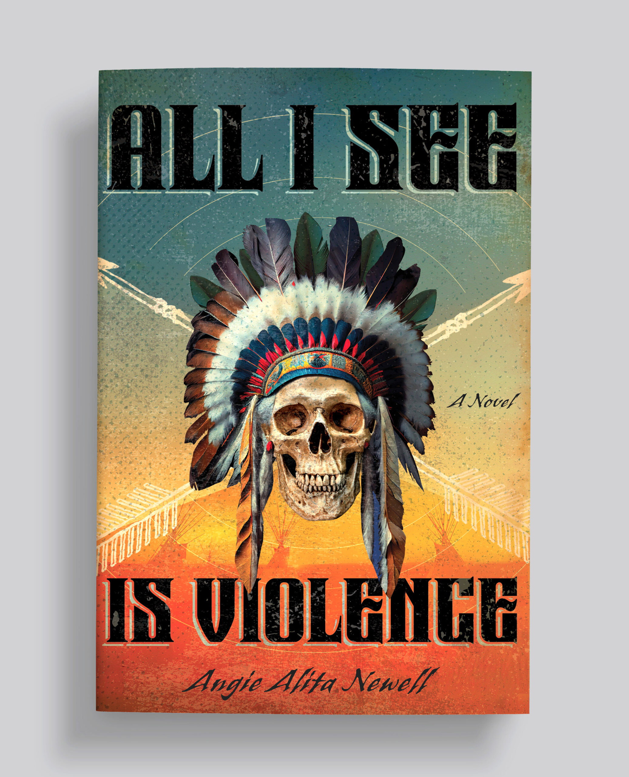
The last piece of the imagery puzzle was to decide if I wanted to have the main image of the headdress isolated with no other imagery on the cover or add more elements. After trying the headdress isolated, the composition looked too bare. It needed a supporting element. The main character of the book is a Native American woman, and I had saved a perfect image of a woman in the distance while doing image research. After removing some teepees, it left the perfect space for the author’s name to go. I was happy with the addition of the woman because the headdress leads your eye from the top of the composition all the way down as you read the title and directly to the image of the woman.
Finally, I needed to make the whole design feel glued together, and I did that by adding some texture and a layer of sepia set overlay to make the individual elements feel more cohesive and have a similar color grading. I also brushed in a slightly more vivid orange color spot at the bottom right corner over the trees to help give it a subtle secondary focal point and create some visual interest.
After completing the front cover, it was also fun to design the full dust jacket mechanical and continue the design from the cover all through the back cover and flaps. When it was printed, I went with a matte coating with a spot gloss varnish over the title and other key elements to make them stand out even more.
I’m really happy with how this design turned out, and it has become one of my favorite book covers that I’ve designed. I sent the author three other different designs to pick from; she had a hard time picking which design to go with, but ended up choosing this one. I’m glad she did because it turned out fantastic.

Kim holds a BFA in graphic design from Watkins College of Art, Design & Film in Nashville, Tennessee. Before finding her home in the publishing world as a book cover designer, Kim worked in the advertising industry, creating award-winning campaigns for many high-ranking clients. After spending some additional time as an art director of a university magazine and working on several small-press photography books, she knew book design was her calling. When not busy creating, Kim is browsing bookstores looking for great reads and terrific covers.
Neil Gonzalez is a professional graphic designer in Austin, Texas, who has specialized in book design for the past 17 years. He got his degree in design from Texas State University and has designed hundreds of book covers and interiors that include The Wall Street Journal and The New York Times bestsellers. He works as the art director for the Greenleaf Book Group. He also loves playing guitar and playing classic computer adventure video games.
Social: Instagram, Facebook, LinkedIn, X (Twitter)
Check out our other Design 2024 and Design 2025 winners on our website!
You may also like
Skolos-Wedell: The Scale of a Poster
Featured in Graphis Journal 386, Nancy Skolos and Tom Wedell are consummate designers. Deeply thoughtful and inquisitive,…
Read MoreWhere to Next? Student Team of Ross, Why? Reimagines Birkenstock
This is student work—and it’s award-winning. In “Where to Next?”, a team working under the name Ross,…
Read More
Related Annuals & Publications
View All


Become a Graphis Member
- 1-Year Membership Subscription
- Enjoy 50% off on Call for Entries
- 1-Year FREE Subscription to Graphis Journal
- Your Portfolio online with profile + links
- Get 20% off on Graphis Books